Build a beautiful, functional site with Figma and Framer components
Discover our expansive design system with hundreds of Figma UI components and templates, ready for Framer integration. Meticulously organized with variables, variants, and adaptive layouts, our extensive UI kit is made from decades of expertise in UI/UX design.
New update
UI Templates
Introducing a collection of fully designed and functional components, tailored to enhance your Figma and Framer projects.
DEBIT CARD
**** **** **** 2859
Valid thru 06/24
All your cards in one place
Smart cards
Make your finances work for you with the power of AI. From tracking expenses to planning investments, gain insights.

Hola Spine
prepared a report
2m ago

Eva Solain
invited you to a chat
5m ago

Pierre Ford
invited you to a meeting
5m ago

Steve Ater
Invited you to a chat
1d ago
2 unread
All-Access
$
49
$99
One-time, 50% off
All 300+ components
2,000+ Figma variants
2,116 unique icons
Framer components
Customize everything. Layouts, styles, patterns, breakpoints, icons.
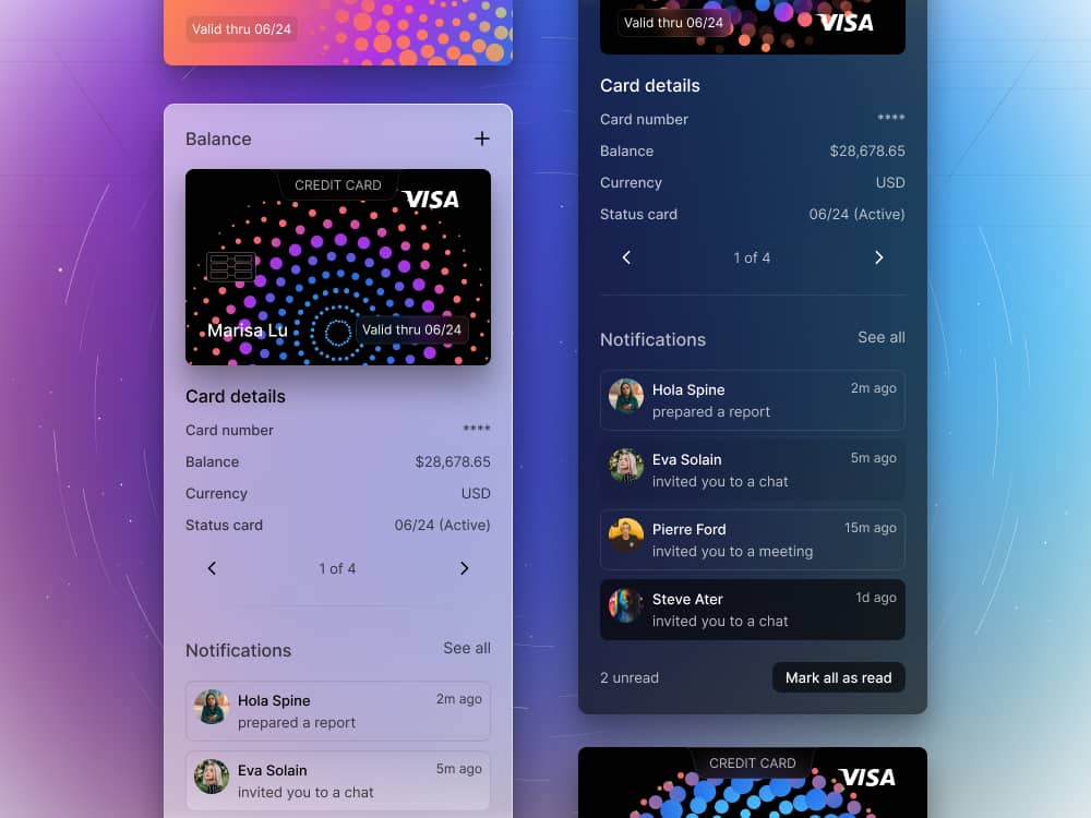
What makes DesignCode UI unique is its theming. The aesthetic is unmistakably different and personal. The background sets the mood, the glass absorb the colors and the shadows elevate. Despite that, it’s super flexible.

CREDIT CARD
**** **** **** 2859
Valid thru 02/26
Card details
Card number
****
Balance
$28,678.65
Currency
USD
Status card
06/24 (Active)
Notifications
See all

Hola Spine
prepared a report
2m ago

Eva Solain
invited you to a chat
5m ago

Pierre Ford
invited you to a meeting
5m ago

Steve Ater
Invited you to a chat
1d ago
2 unread
New update
UI Templates
Introducing a collection of fully designed and functional components, tailored to enhance your Figma and Framer projects.

Meng To
Designer and coder
Yes, if you’re new to SwiftUI, I recommend taking the iOS course first since it covers more the basics and is more complete with 60 videos.
Complete design system. Every element, big or small, is a component.
Optimize your design process with Figma's Variables and Framer's true implementation, ensuring design consistency and creating adaptable design systems. This all-in-one package provide comprehensive guides to help you every step of the way.
25 Components
Buttons
In any design system, buttons serve as crucial elements as they prompt users to take actions. They hold significant roles in guiding users through an interface. Understanding their use and customization in our system will streamline your design process.
Light/Dark Mode
Size: Regular, Medium, Large, Extra Large
Left or Right Icon
2,116 Icons
States: Normal, Hover, Selected, Active
Variables: Colors, Spacing, Themes
20 Components
Controls
Design systems provide a wide range of controls to help facilitate user interaction with your interface. In our Figma UI Kit, you will find various controls like segmented controls, toggles, and search bars, each designed to enhance user experience.
Light/Dark Mode
Size: Regular, Medium, Large, Extra Large
1 to 5 segments
Auto Layout and properties
Variables: Colors, Spacing, Themes
260+ Components
Menus & Content
In the world of UX/UI design, components like menus, popovers, navigation, and sidebars are vital in enhancing user experience. Figma and Framer offer a diverse range of these UI components to boost your design capabilities.
Light/Dark Mode
Size: Regular, Medium, Large, Extra Large
States: Normal, Hover, Active, Inactive
Auto Layout and properties
Variables: Colors, Spacing, Themes
Limited-time pricing
As we grow our library of UI components, we’re introducing a limited-time pricing that’s not only 50% off but also significantly cheaper than what’s on the market
Basic
Free
Preview
50 components
200+ Figma variants
1,000 unique icons
Auto Layout
Glass style only
Figma only
Lifetime updates
Unlimited projects
Single user license
All-Access
$
49
$99
One-time, 50% off
All 300+ components
2,000+ Figma variants
2,116 unique icons
Auto Layout, 200+ Variables
Glass, Outline, Flat styles
Figma & Framer components
Lifetime updates
Unlimited projects
Single user license
Team
$
149
$299
One-time, 50% off
All 300+ components
2,000+ Figma variants
2,116 unique icons
Auto Layout, 200+ Variables
Glass, Outline, Flat styles
Figma & Framer components
Lifetime updates
Unlimited projects
Up to 5 users license
Hear It From Our Customers
Our clients' success stories are at the heart of what we do. These detailed accounts showcase their journey of growth, innovation, and success, facilitated by our collaborative partnerships and tailored solutions.
Frequently Asked Questions
Have questions? We've got answers! Our FAQ section is designed to provide you with information on payment methods, refund policies, customer support, access to purchases, update frequencies, and licensing details for DesignCode UI.
After purchasing DesignCode UI, you can find your Figma and Framer files, along with your unique license on Lemon Squeezy. Log in on LemonSqueezy.com Go to "My Orders" Click on DesignCode UI Find the downloads in "Files" Find your license under "Licenses".

