May 9, 2024
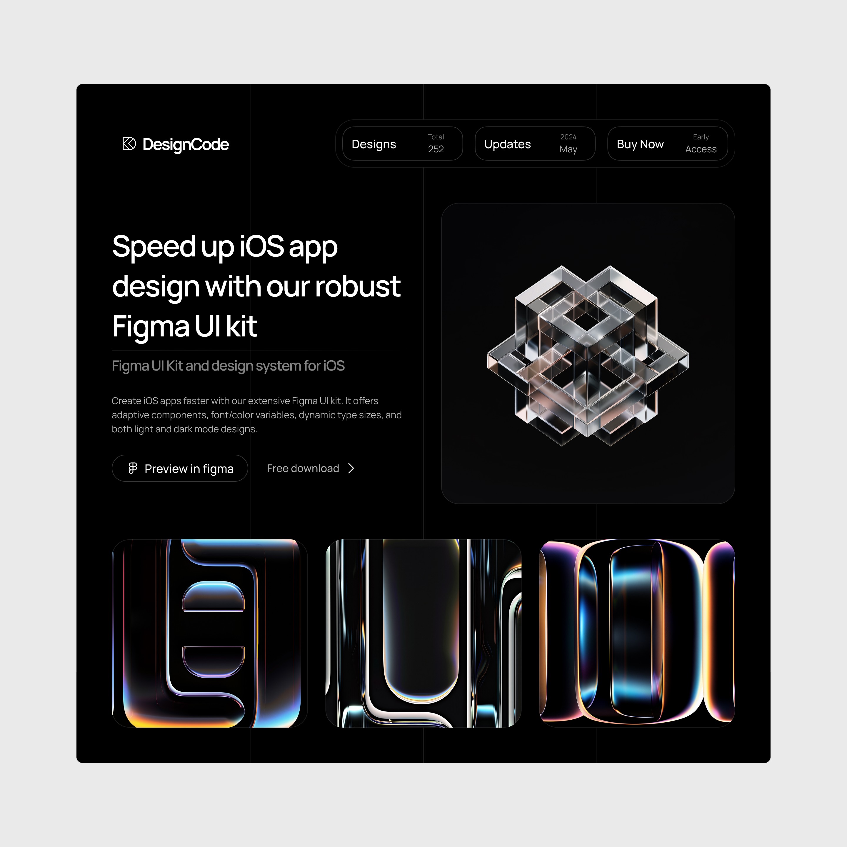
New Responsive UI Template
We are thrilled to introduce our latest update to DesignCode UI, focusing on responsiveness and adaptability across all device screens. - Responsive Features: Utilizes AutoLayout Wrap and MinMax Width to ensure perfect fitting on all devices. - Dynamic Styling: Incorporates typography and color variables for consistent aesthetics. - Light and Dark Mode Ready: Optimizes visual comfort and readability in any user setting. Explore the full potential of responsive design with our latest template in DesignCode UI. Perfect for demonstrating adaptability and style in your projects!

Meng To, designer and coder
Apr 22, 2024
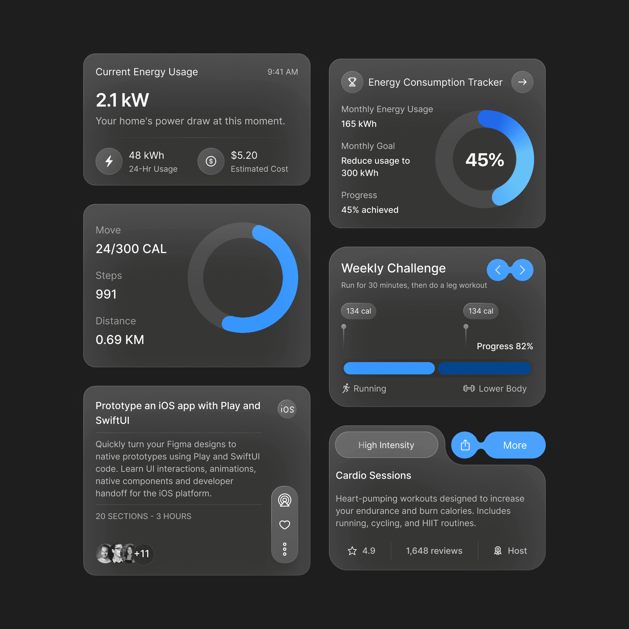
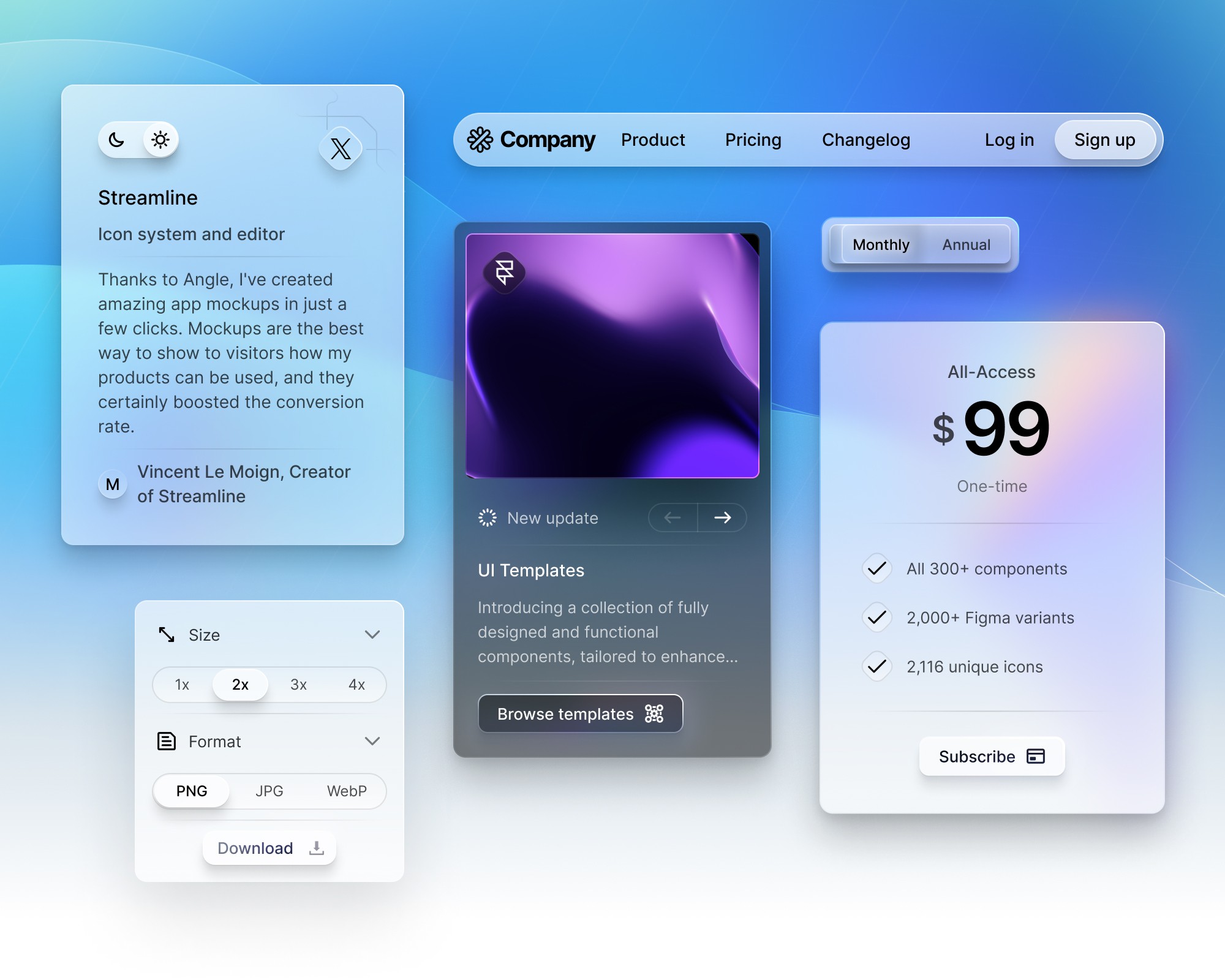
Typography, Gradient Variables and 32 New Components
We're excited to announce significant updates to DesignCode UI, bringing a wealth of new components and enhanced features that will transform the way you design and build interfaces. What's New? - 32 New Components: Our library has expanded with an additional 32 components, offering more versatility and creative options for your projects. - Typography and Gradient Variables: To provide more control and flexibility, we've introduced typography and gradient variables. These additions make it easier to maintain consistency and adapt components to different contexts and styles. - Enhanced UI Styles: The aesthetic of our Flat UI and Outline UI has been greatly improved, utilizing variables more prominently for new components. - Light and Dark Mode Support: Both modes have been refined, ensuring that our components perform beautifully in any setting. These updates are designed to empower you further, making DesignCode UI not just a tool, but a comprehensive solution for your design needs. Dive into a more dynamic and versatile world of design with our latest offerings.
Meng To, designer and coder
Nov 22, 2023
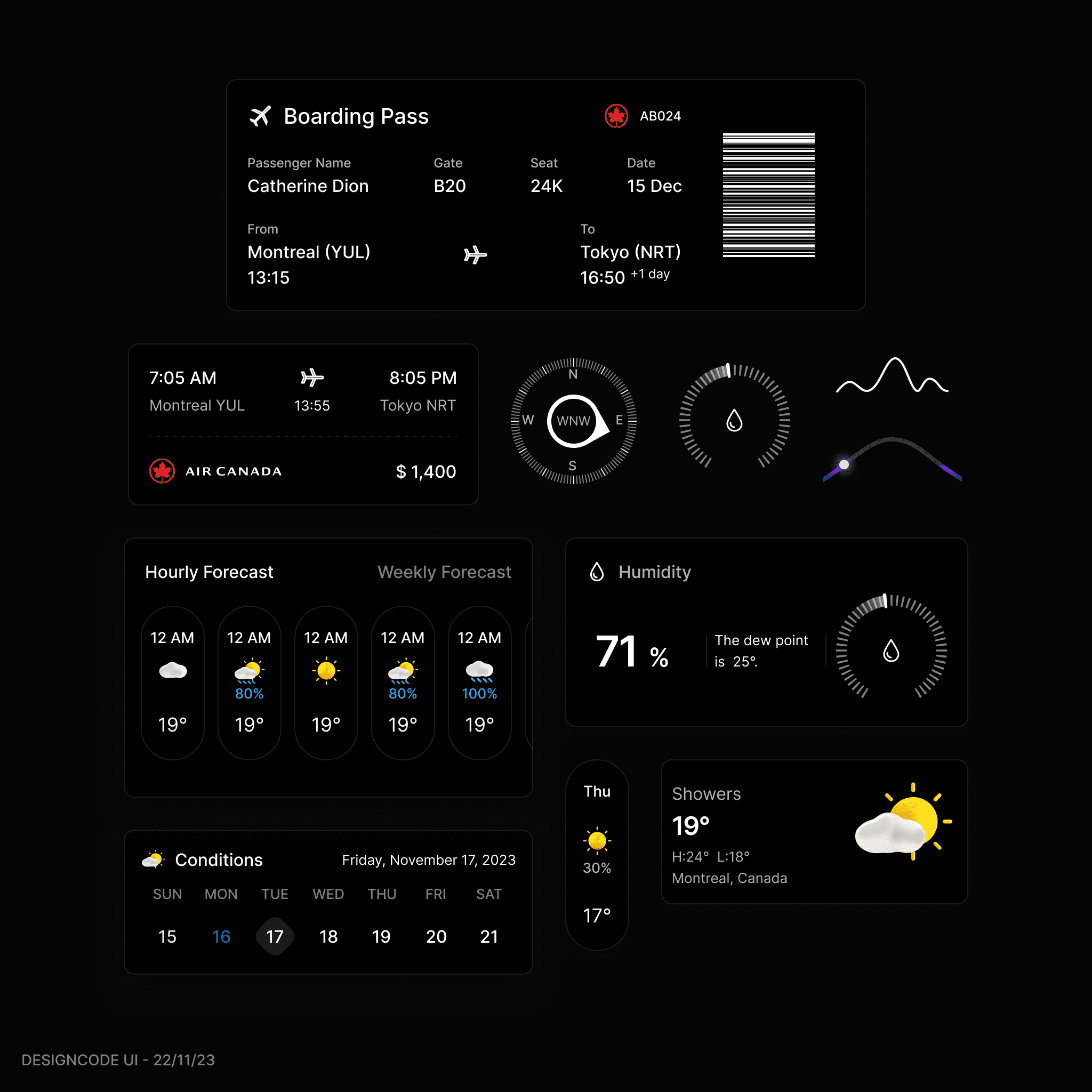
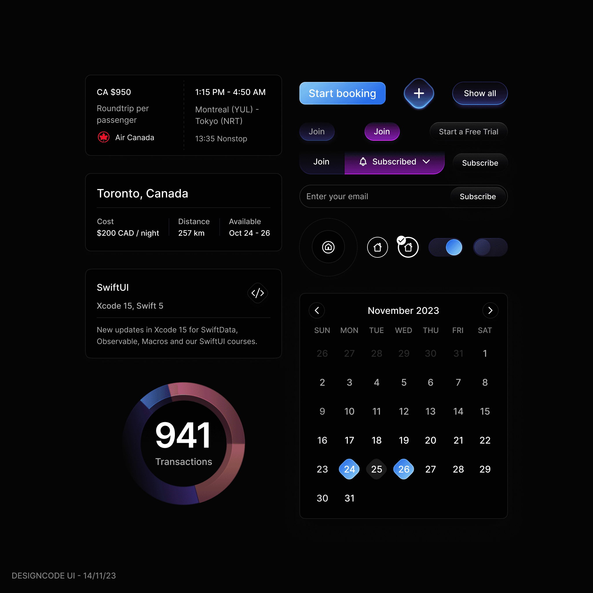
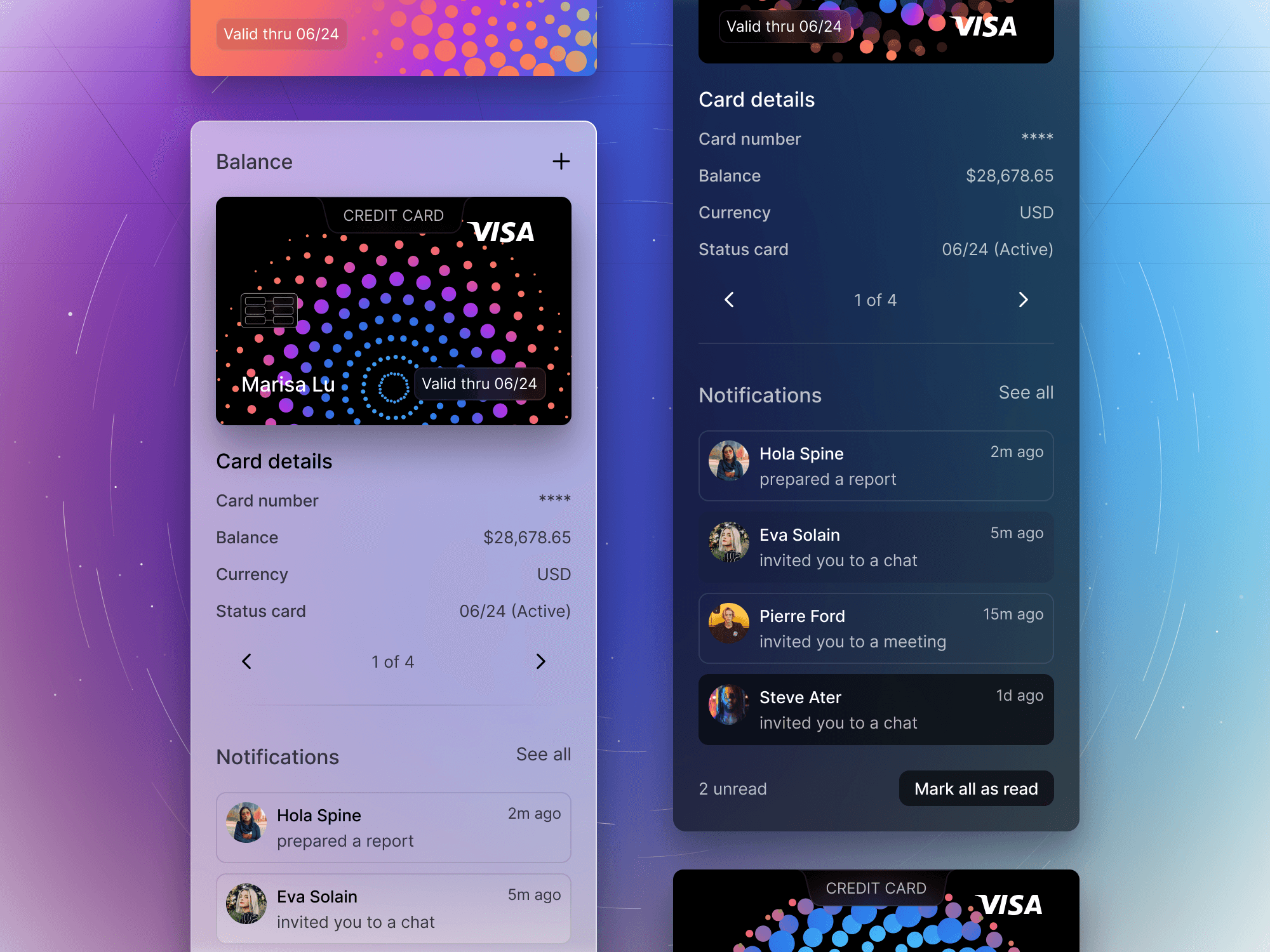
New UI Components: Travel and Weather Card Layouts
The latest UI update introduces a streamlined design for a travel app that merges boarding and weather details into a cohesive dark-themed interface. The boarding pass module is now more compact, displaying essential flight information clearly. Flight times and pricing are neatly summarized, while navigation and altitude are visually represented with intuitive dials. The weather forecast is bifurcated into hourly and weekly outlooks, providing comprehensive data at a glance. A humidity gauge with dew point readings complements the succinct current weather conditions display. This update prioritizes a balance between aesthetics and functionality, enhancing overall user experience with a focus on clarity and efficiency.
Meng To, designer and coder
Nov 20, 2023
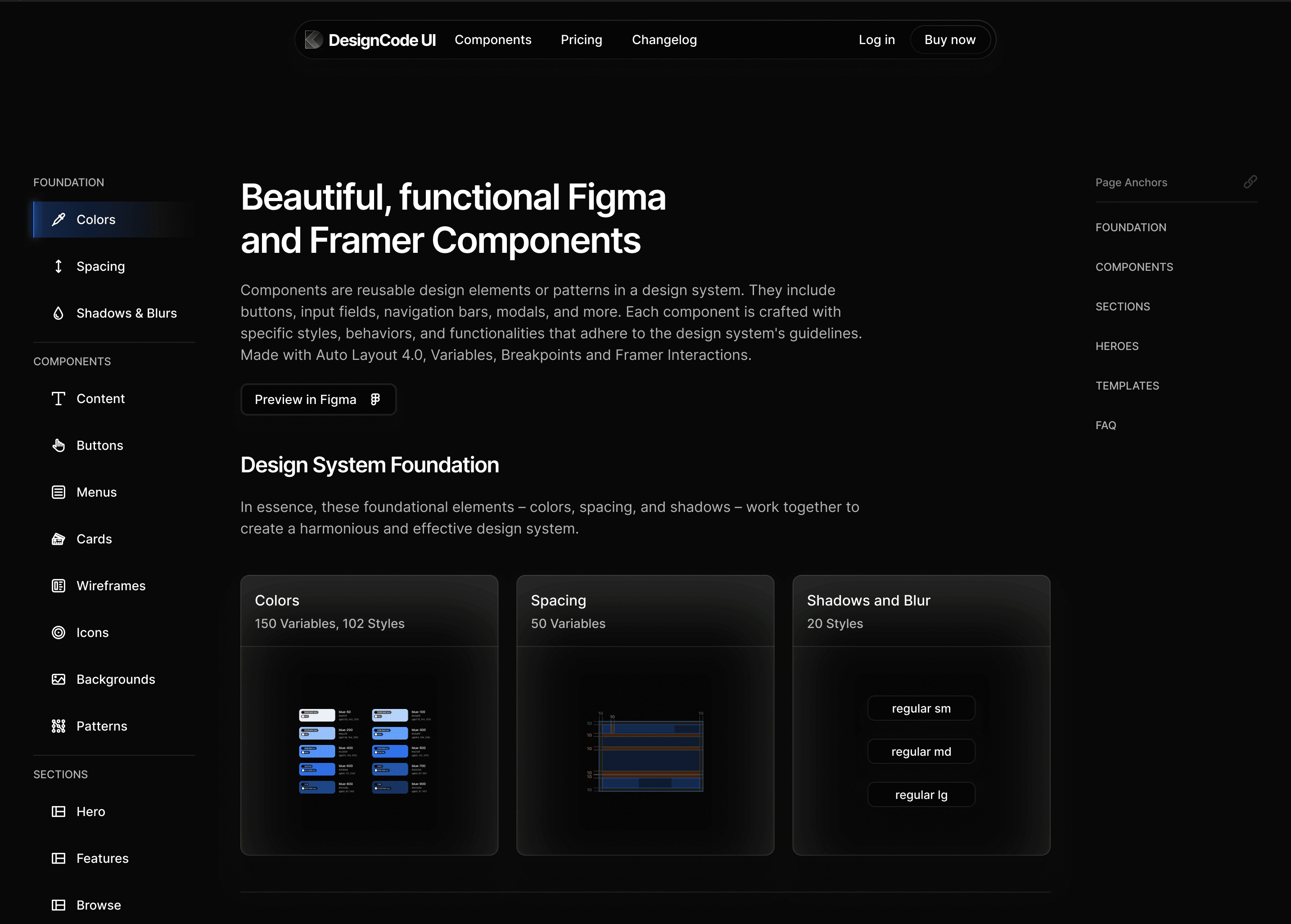
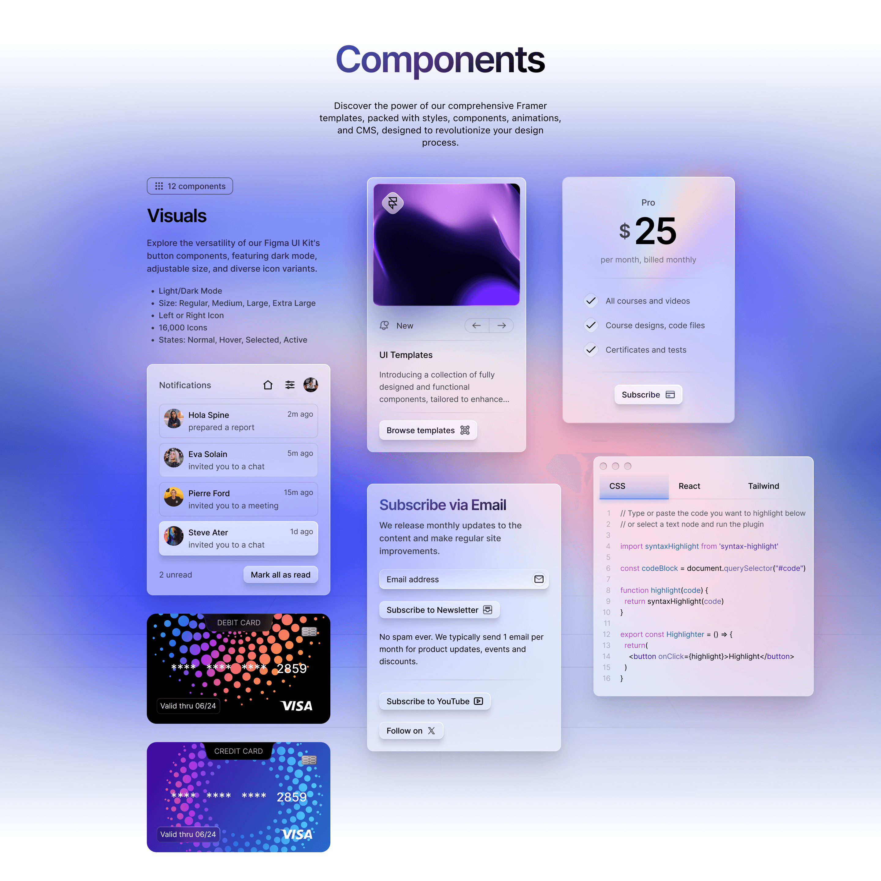
New Page Addition: Components Showcase
The new "Components" page on our website offers a detailed showcase of UI components, categorized and accompanied by full detail pages. It includes comprehensive guides on colors, spacing, shadows, and typography, along with explanations for each component's usage. The page supports light and dark modes and features full animations and interactions in Framer. Updated UI templates with the latest designs, including new wireframes and component page designs, are also available, providing practical resources for designers and developers.
Meng To, designer and coder
Nov 16, 2023
Dark Mode Outline Style
This update introduces a new 'Outline Dark Mode' style, enhancing the UI with a modern, minimalistic design. This style is compatible with various UI themes and adds functionality with fresh components. - New style: Outline Dark Mode, minimal and modern. - Compatible with most UI themes. - Over 20 new components, including button charts, cards, and calendars. - Updated buttons, toggles, and inputs. - Existing components available in the new style.
Meng To, designer and coder
Nov 12, 2023
Dark Mode and 3D Backgrounds
The update brings a system-responsive Dark Mode, where the UI colors adapt to your system's light or dark settings. This is achieved through centralized color mapping in Framer, allowing any changes in color styles to automatically update across all components. This means that adjustments to primary colors like backgrounds or outlines will seamlessly apply to all relevant elements.
Meng To, designer and coder
Nov 9, 2023
Create your first button for the design system
Firstly, either create a new template or select a page within your design system specifically for buttons. For our example, we'll refer to this page simply as "Buttons." Organizing Your Buttons Ideally, you should have a minimal number of button variants to maintain simplicity. However, depending on your design's complexity, you may have multiple styles and variants to provide the necessary flexibility. Creating a Button - Add Text to Your Button: - Use the text tool (often shortcut 'T') to add your button's text. - Apply the "Body" text style, choosing between "Regular" and "Medium" based on the emphasis you want to give your text...
Meng To, designer and coder
Nov 8, 2023
New Buttons and Tutorials for Colors, Spacing and Shadows
Here's what's new: New Components: - Gradient button - Play button - Floating menu Enhanced Learning Resources: - Live stream tutorial explaining the design system for beginners and teams. - Detailed tutorials for colors, spacing, shadows, and blurs with practical examples. Templates Under Development: - Courses template - Video streaming template - Booking template Keep your design toolkit updated—more components, templates, and sections are on their way to enhance your design journey. Stay tuned!
Meng To, designer and coder
Nov 6, 2023
Deep dive into design systems in Figma and Framer
This livestream is a deep dive into design systems in Figma and Framer. Intro: 0:00 - Intro, Meng moved to Singapore 1:24 - Why create a Design System? Variables: 9:00 - Explaining variables and design tokens 13:43 - Primitives and contextual values in variables Spacing: 15:31 - Importance of spacing 16:17 - Using 8-point grid system Semantics: 21:22 - Semantic naming for contextual values Components mapping: 37:52 - Mapping components to light/dark modes 39:48 - Mapping components to breakpoints Framer implementation: 50:51 - Demo of implementation in Framer 52:56 - Tips for transitioning from Figma to Framer 1:06:35 - Figma plugins 1:11:20 - Pricing for DesignCode UI
Meng To, designer and coder
Nov 3, 2023
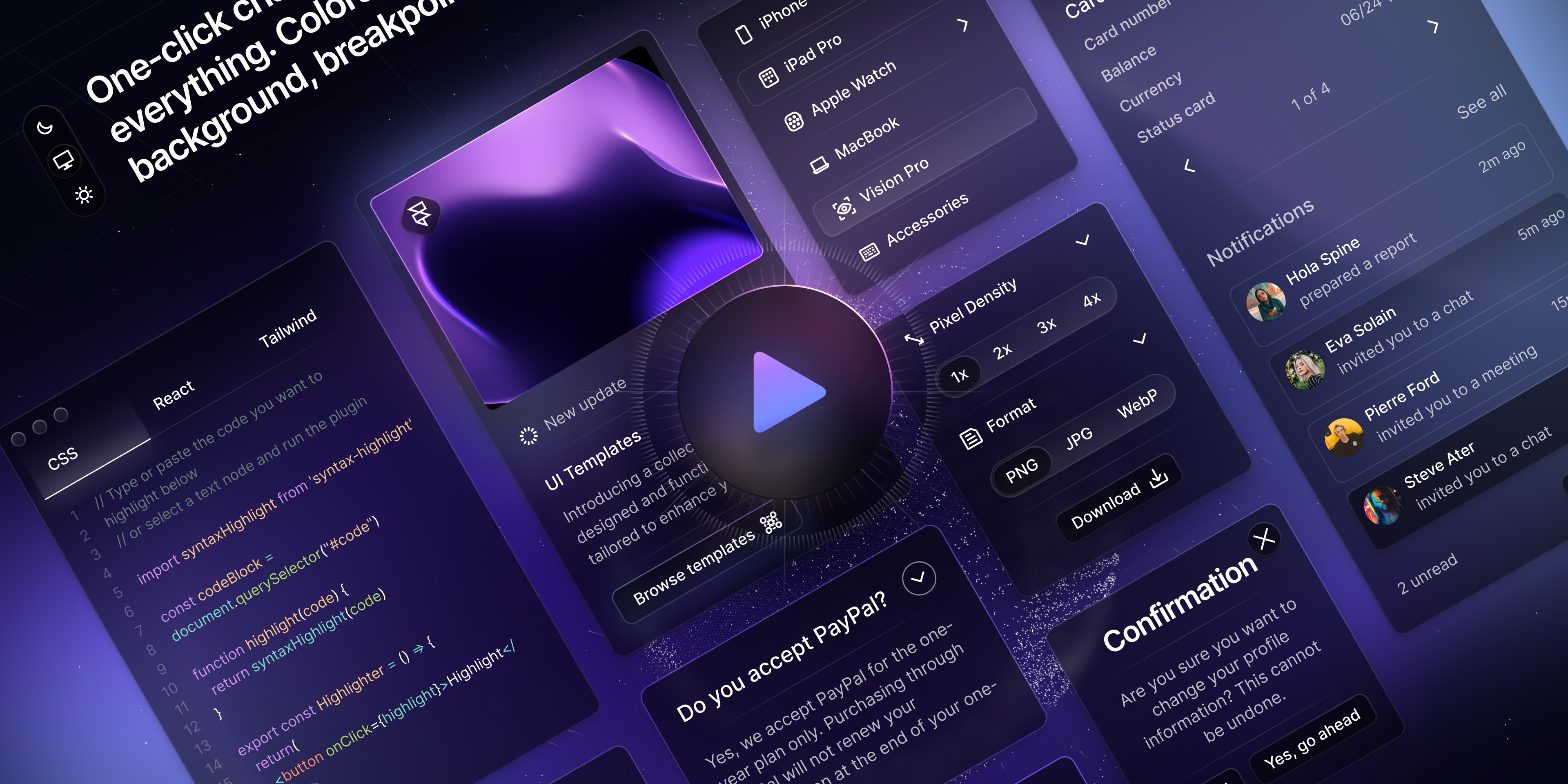
Some tips for preparing for Mobile
- Make sure that your content is set to Fill and can fit in a 375 width. Desktop typically uses max-width. - Avoid Fixed sizes, embrace min/max values. - Screen paddings for Mobile are vastly different from Desktop and Tablet. They are as follow: 96 for Desktop, 24 for Tablet and 20 for Mobile. Content paddings and gaps also scale similarly. - For Headings, use the Mobile counterparts. E.G. Heading 1 to Mobile Heading 1. - For best CSS implementation, set everything to Auto Layout. There are 2 elements that use Absolute: backgrounds and overlays. - Typically, Auto Layout direction is set to Vertical for Mobile and Horizontal for Desktop. - Use Auto Layout Wrap when you can. This saves the trouble of switching direction. - Some assets like mockups and illustrations need to be scaled (K) at 0.75x or 0.5x for Mobile.
Meng To, designer and coder
Nov 1, 2023
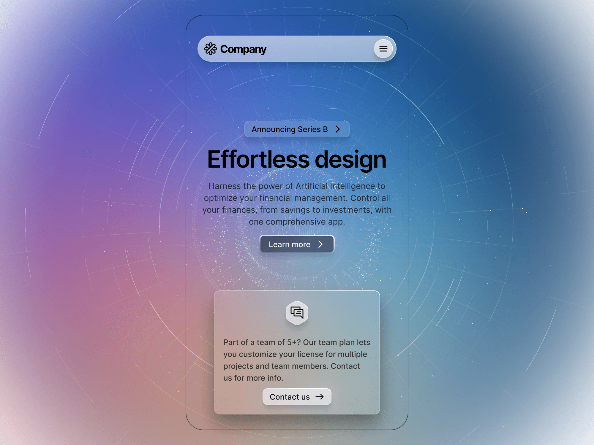
Light/Dark Mode and Styles
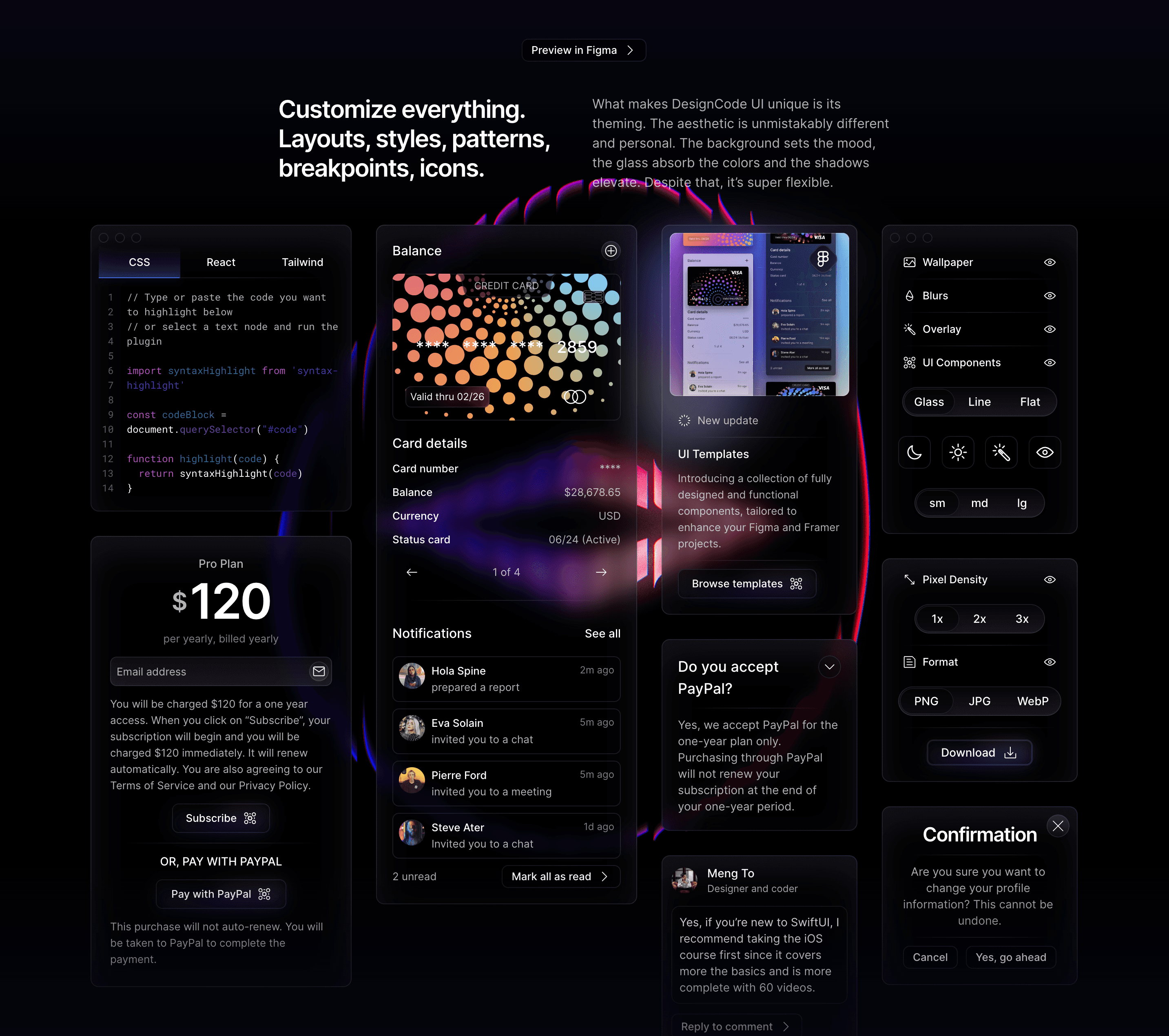
What makes DesignCode UI unique is its theming. The aesthetic is unmistakably different and personal. The background sets the mood, the glass absorb the colors and the shadows elevate. Despite that, it’s super flexible. Here is how you can switch between light and dark mode, and adjust styles: Select the “DesignCode UI” frame and in the Inspector / Layer, select the Style and Colors that you want. Select Dark and booooom! This works on every single component! Please note that Style should be selected before Mode. That’s because Dark Mode is only explicitly created for Glass. The rest uses Variables. Choose between three styles: Glass, Outline, and Flat. - Glass: Utilizes gradients and drop shadows. - Outline: No gradients, only outlines. - Flat: Neither outlines nor drop shadows. Theming is available for individual component, including nested ones. All styles use a blurred layer, making them versatile for any background. This is useful for various applications, including desktop and web pages.
Meng To, designer and coder
Oct 29, 2023
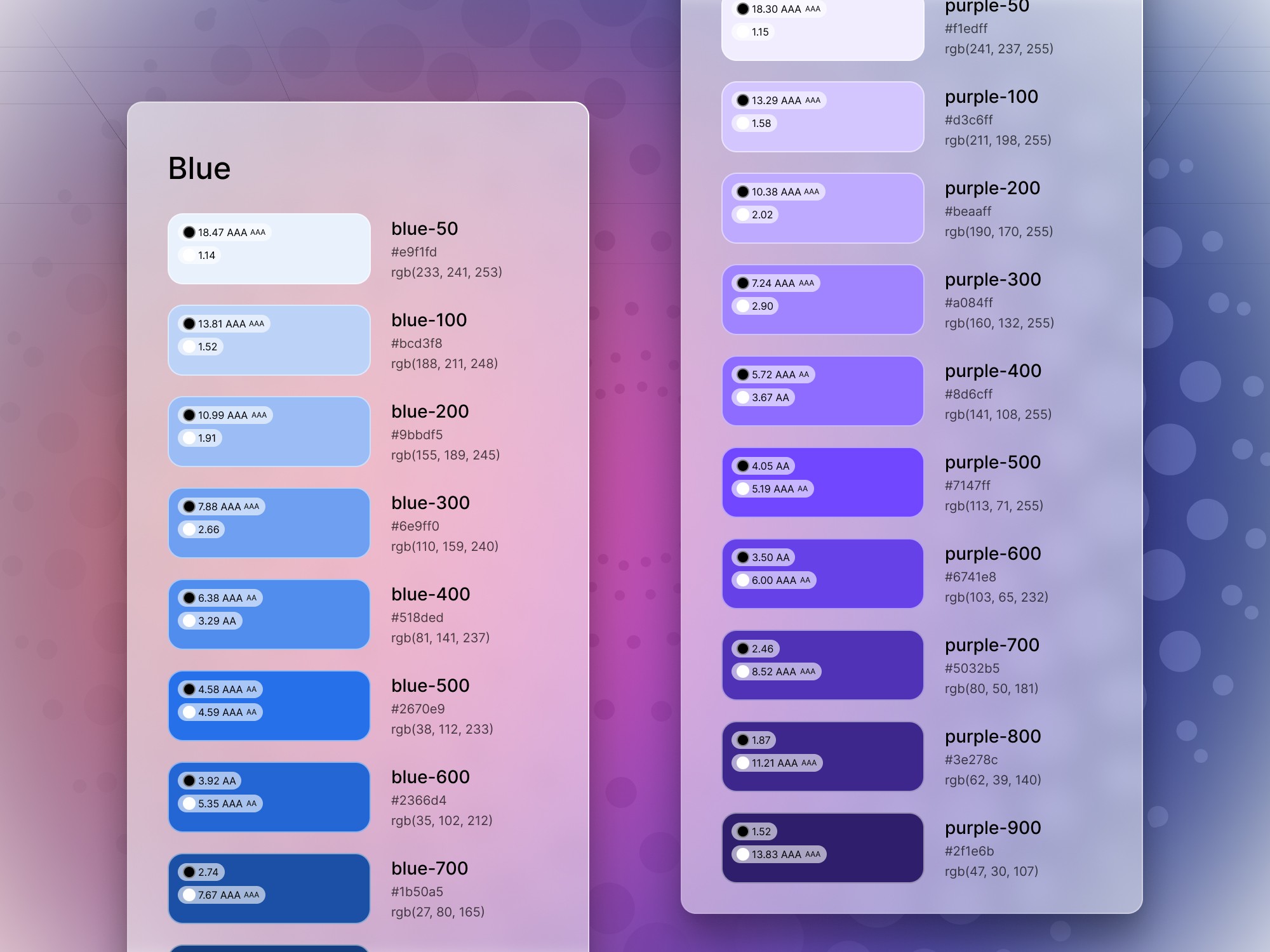
Primitives, Variables scoping and Brand colors
In building your design system, aligning with established standards like Figma's guidelines and Apple's UI Kit is crucial. Here's a breakdown of this approach: - Primitives: Hidden from publishing and scoping, these include basic colors like black, white, red, etc. with different variations. This allows for context on color usage and offers complementary colors. - Semantic colors: Named intuitively to guide users on usage, e.g., "background border," "container divider." Context is important. - Variables scoping: Restricts usage of values to their intended context, making it clear that a border color shouldn't be used for text. By focusing on consistency, clear naming, and contextual scoping, you're creating a robust design system that's both user-friendly and in sync with industry standards.
Meng To, designer and coder
Oct 27, 2023
Breakpoints
In this update, we introduce breakpoints. This feature effortlessly transitions between desktop, tablet, and mobile views. If a component is too large or small for a particular device, breakpoints will map the correct instance, ensuring optimal design adaptation across different screen sizes through component properties.
Meng To, designer and coder
Oct 25, 2023

Background System
DesignCode UI boasts a distinct background system. Users can toggle between patterns like waves, vortex, grid, and stars, with more additions anticipated. Coupled with a diverse range of colors and blurs, these offer thousands of visually appealing combinations. This system simplifies the often challenging task for developers and beginners of crafting striking backgrounds to complement UI designs.
Meng To, designer and coder
Oct 25, 2023
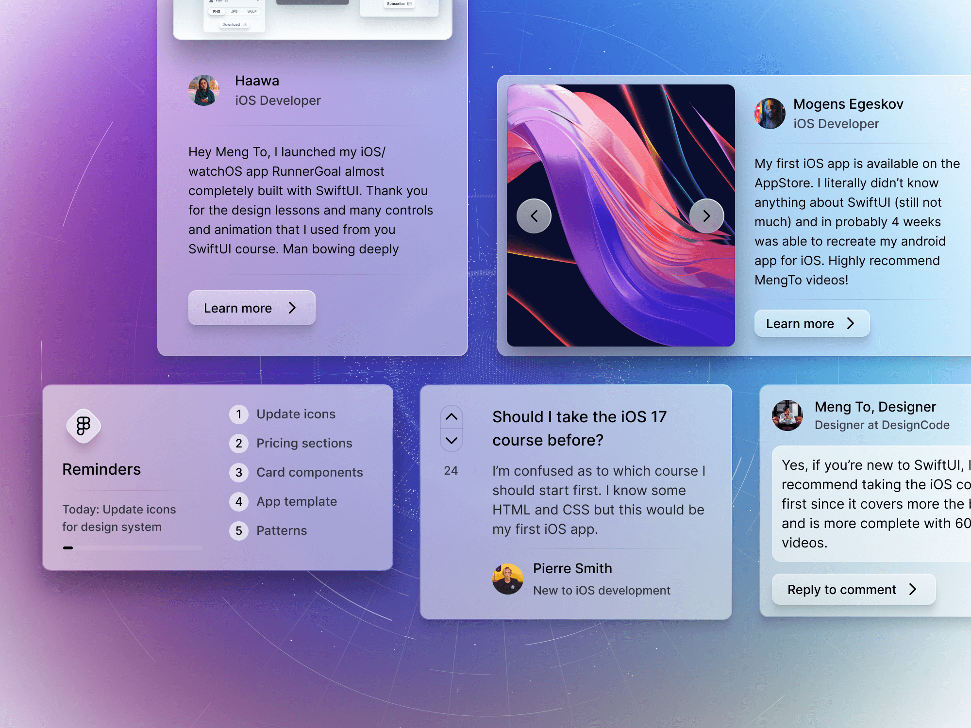
Story cards, Comment, Reply, Reminders
4 components, 16 variants DesignCode UI now offers a comprehensive component library tailored for interactive websites emphasizing social interactions: - Commenting & Replying: Facilitate user discussions and feedback. - Uploading: Seamless content addition by users. - Image Presentation & Browsing: Display and navigate through visuals effectively. - Tasks & Reminders: Organize and prompt user activities or obligations. This enhancement ensures websites are equipped to engage and interact with users effectively.
Meng To, designer and coder
Oct 25, 2023
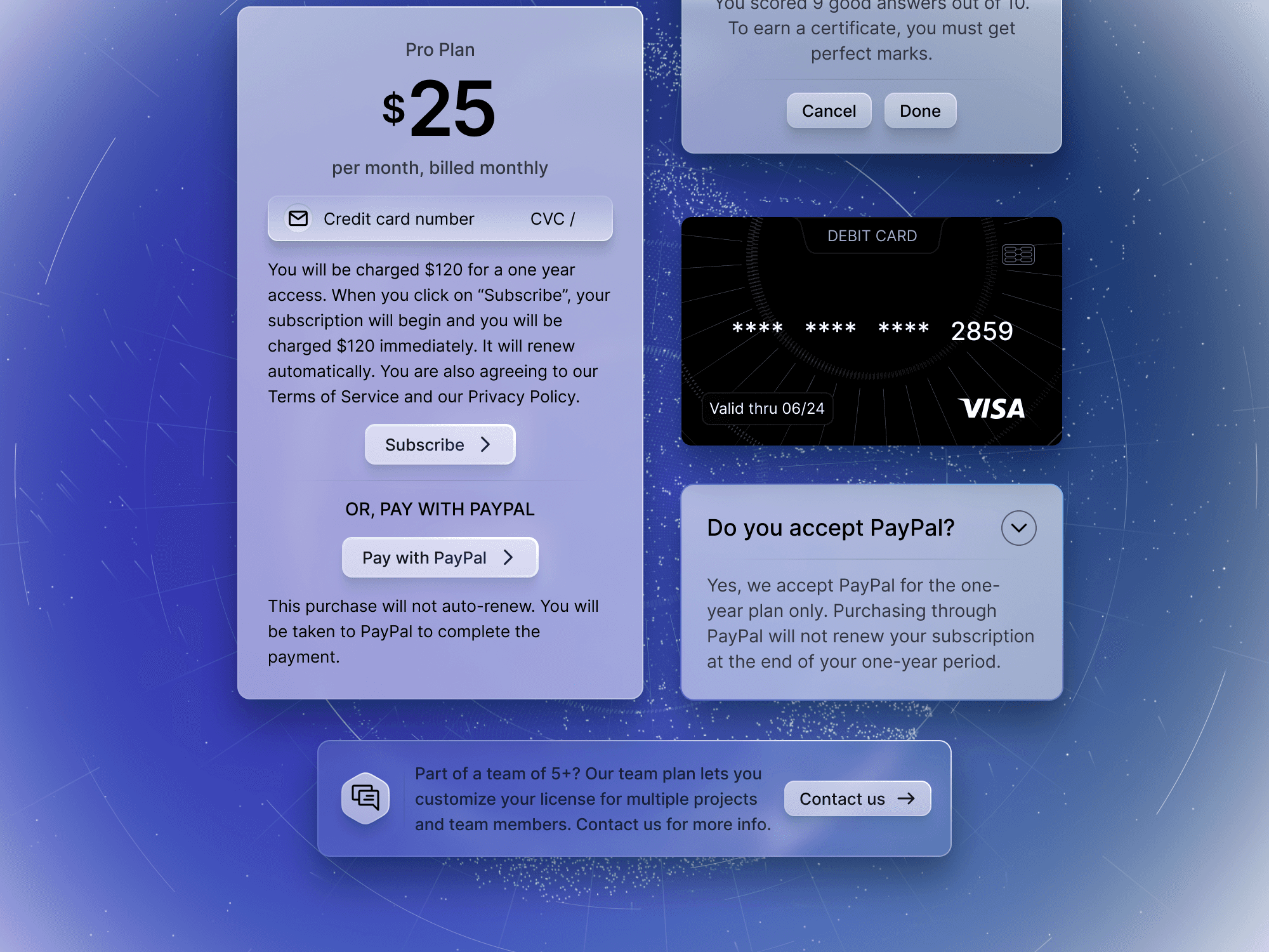
Payment Card, Alert, FAQ
3 components, 12 variants For projects reliant on payments, DesignCode UI offers extensive component support: Cards: Essential for displaying payment methods. - FAQ: Address common payment-related questions. - Payment Model: Handle transaction details. - Alerts: Notify users of payment updates or issues. - Pricing Cards: Clearly list product or service costs. - Contact Card: Provide support or assistance related to payments. With these expanding components and variants, DesignCode UI aims to streamline the payment integration process in websites and apps.
Meng To, designer and coder
Oct 23, 2023
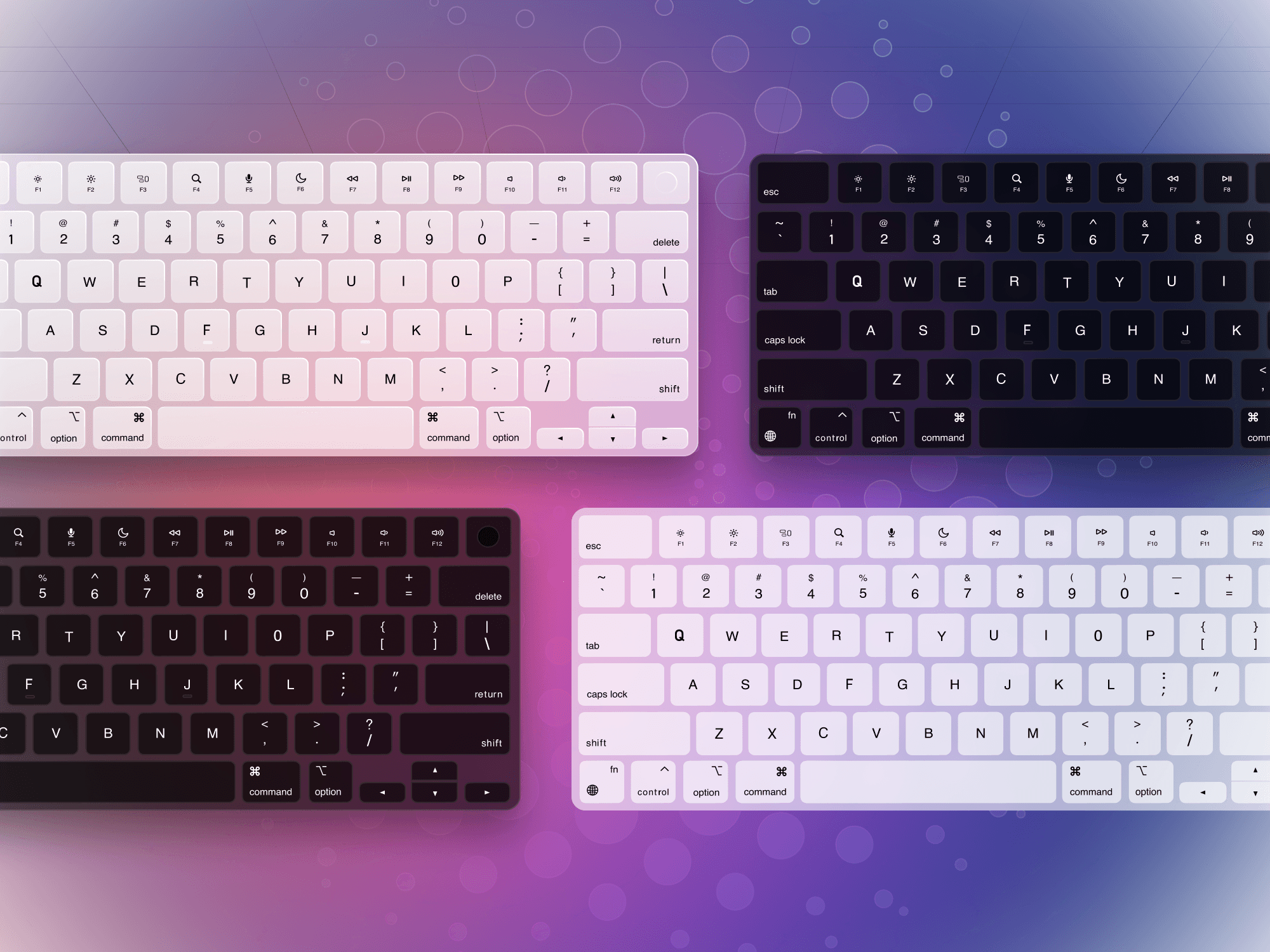
Keyboards
1 component, 4 variants The keyboard can be used to showcase your digital product in a Features section. Developers can significantly benefit from DesignCode UI for several key reasons: - Ready-Made Design: This platform provides with aesthetically pleasing, pre-designed templates, eliminating the guesswork. Focus on Logic: With design elements sorted, developers can spend more time on application logic, functionality, and database connections. - Competitive Edge: In a market where design sells, a good-looking UI is crucial. Companies like Stripe and Linear serve as examples of how impactful good design can be. - Versatility: Whether it's a marketing page, macOS app, or web app, Design Code UI's system is adaptable to various platforms and use-cases. - Trust Factor: Users, not just designers, are more likely to trust a product that looks polished. DesignCode UI provides that level of professionalism right out of the box. - Consistency: Developers often struggle with maintaining UI consistency. A design system like yours can streamline this process. - Time-Saving: Given the library of UI elements and components, developers can quickly assemble functional, good-looking interfaces, which saves them time and effort.
Meng To, designer and coder
Oct 23, 2023
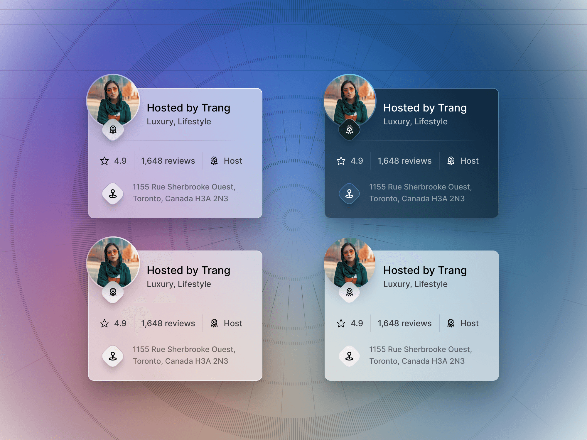
Card Design System
1 component, 4 variants, 16 patterns DesignCode UI's card system is notably versatile. It offers: - Four Variants: Choose layouts with the ship on the left or top right, and similarly adjust logo positions. - Customizable Content: Modify text, validation text, and title. - Pattern Selection: Over 10 patterns available for customization. - Background Adjustments: Alter gradients and colors to fit your design needs. - These features combine to make the card system both functional and unique.
Meng To, designer and coder
Oct 21, 2023
2 New Styles: Outline, Flat
In this update, we're rolling out two new styles alongside our unique light/dark styles: - Flat Style: No shadows or outlines, uses variable colors for automatic light and dark mode. - Outline Style: Includes shadows and an outline, but no gradients. Full Variables. - Light/Dark: Retains use of component properties for light and dark mode, due to gradient support. Each style offers distinct visual features to enhance your design options.
Meng To, designer and coder
Oct 21, 2023
Navigation Menu, Pricing, Toggle
3 components, 12 variants This UI system was made not just for full-width landing pages but also for minimalistic apps like desktop apps with a native feel that fit nicely in a modern macOS and Windows 11 environment. - Sidebar/tooltip menu - Floating navigation menu - Realistic light switch - Floating pricing card - Horizontal/vertical cards
Meng To, designer and coder
Oct 20, 2023
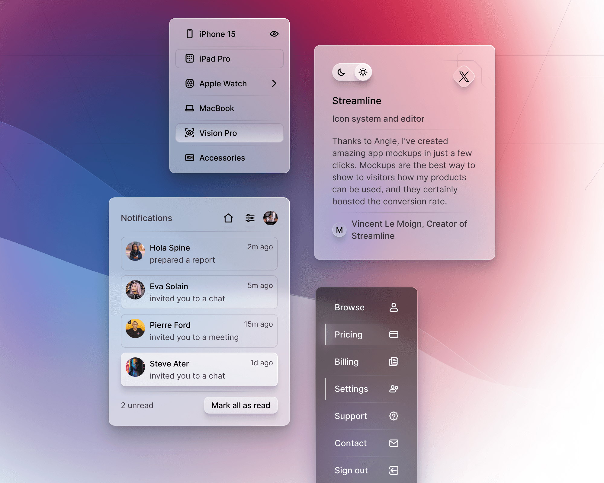
Notifications, Menu, Tooltip, Testimonial
Your design system should aim to solve these pain points: - Templates: Offer multiple pre-designed templates for common elements like menus, navigation bars, or cards to help beginners get started quickly. - Customization: Include easy-to-use customization options like size (small, large, extra-large) that can be changed with a click, ensuring design consistency across elements. - Visual Guides: Detailed visual cues for spacing, sizing, and typography, which are often stumbling blocks for beginners. - UI States: Pre-configured states (hover, active, normal) for various UI elements. This makes the design process easier and ensures usability. - Codability: Mark elements with indicators that show how easily they can be coded, addressing the gap between design and development. - Tutorials: Simple, step-by-step guides to walk her through the platform, focusing on web design basics and best practices. - Plug-and-Play Content: Make it easy to swap out text, brand colors, and logos to quickly generate a usable site.
Meng To, designer and coder