Figma Color Variables and Styles
Effective color use in design systems involves defining a palette of primary, secondary, and neutral colors, then converting these into consistently used color variables. Focus on context, contrast, and cohesion, and experiment with gradients and opacity for depth, while maintaining a professional look.
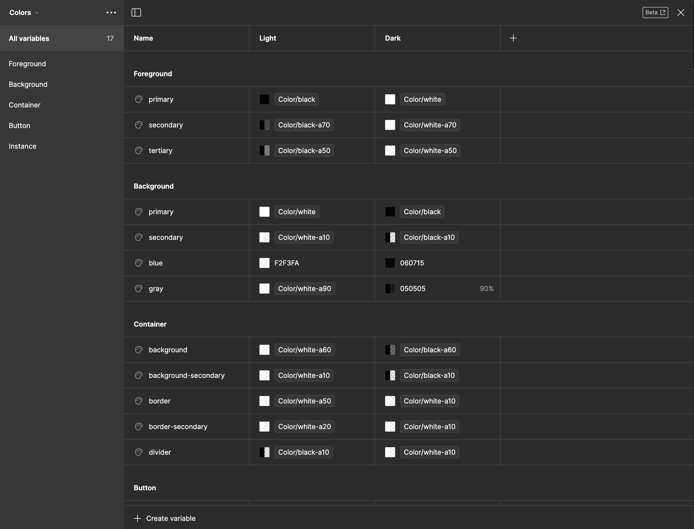
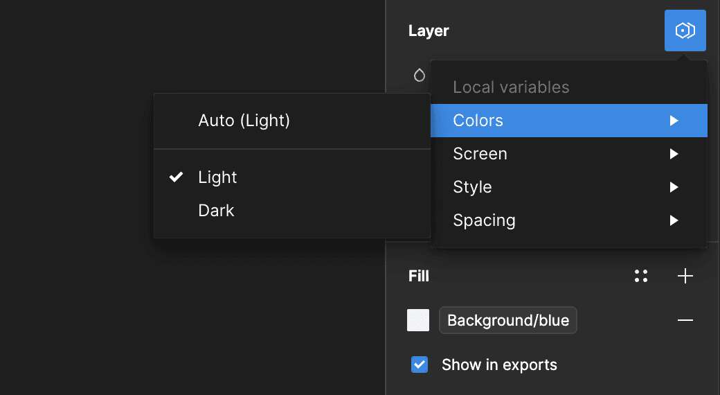
Semantic Colors in Figma
In the dynamic world of Figma, understanding color styles is essential for creating visually compelling designs. Let's dive into the various color styles and their applications:

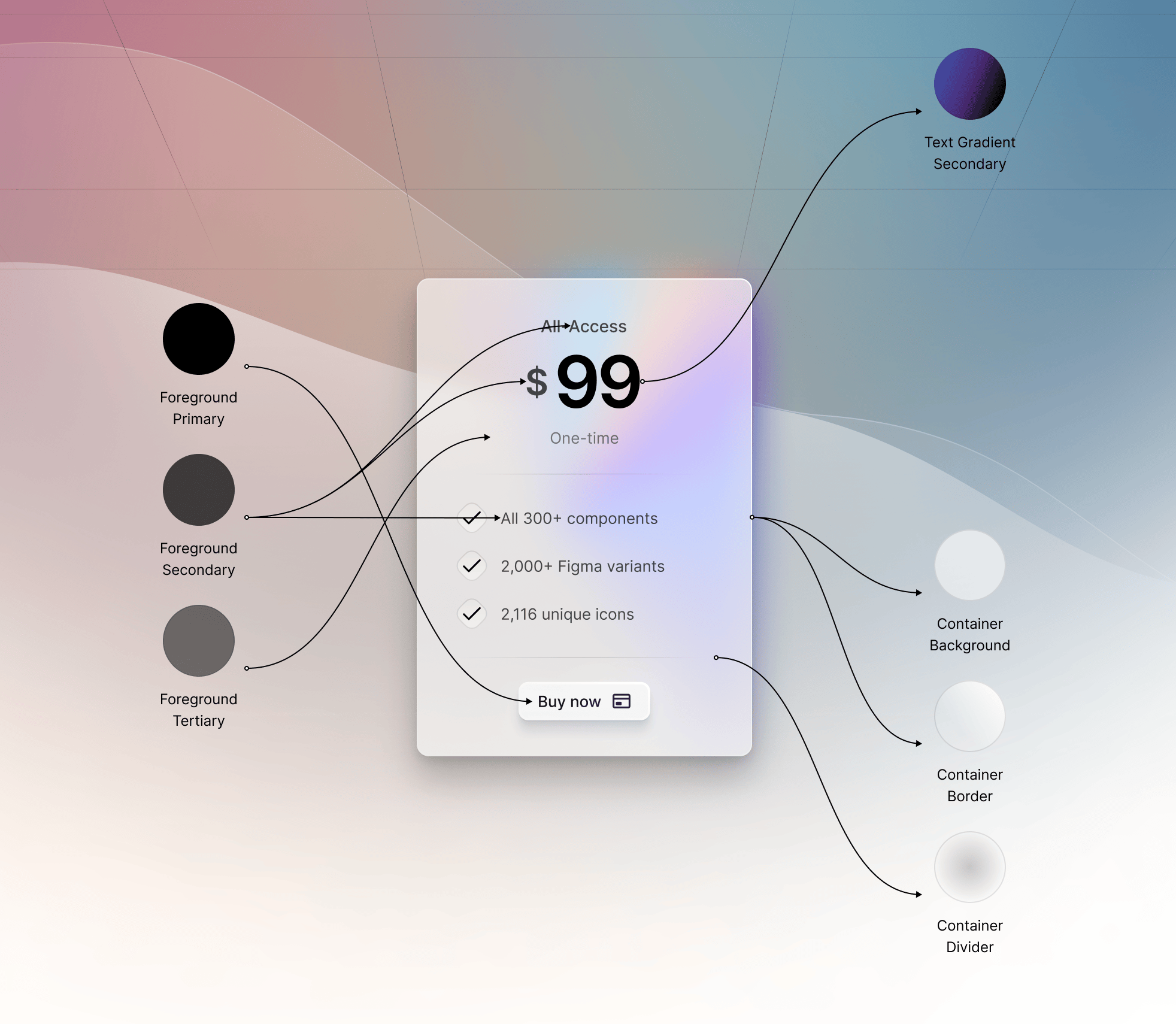
Foreground Color: This category primarily focuses on the colors for texts, icons, and any element that prominently appears in the front. It's the color that catches the viewer's eye first and is crucial for highlighting important elements.
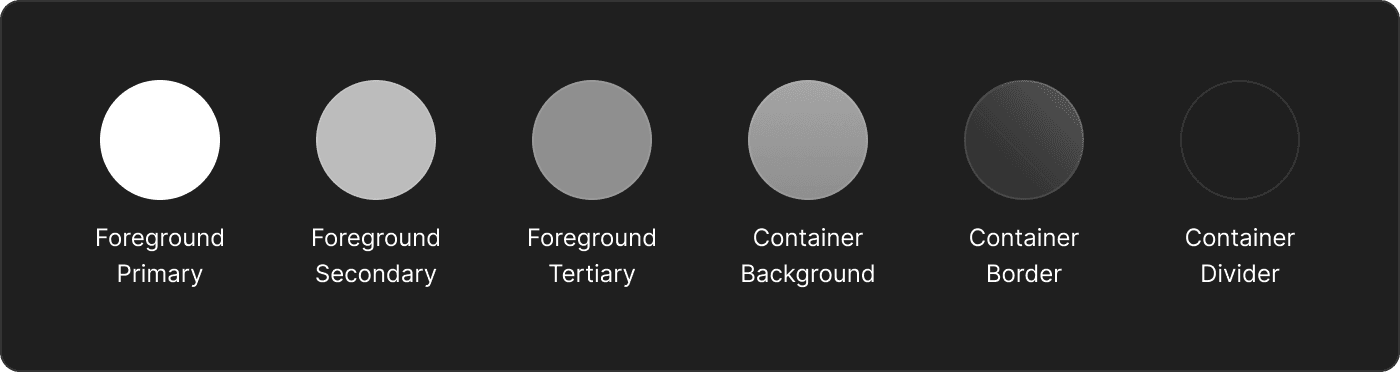
Secondary and Tertiary Colors: These colors add depth and variety to your designs. They are used to accentuate and support the primary (foreground) colors, bringing balance and visual interest to the overall design.
Container Colors: Essential for elements like cards, these colors include container backgrounds, borders, and dividers. They provide structure and clarity, segmenting different sections and content in a design.
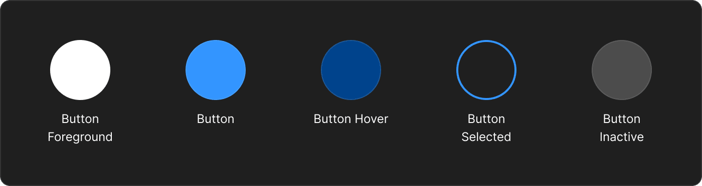
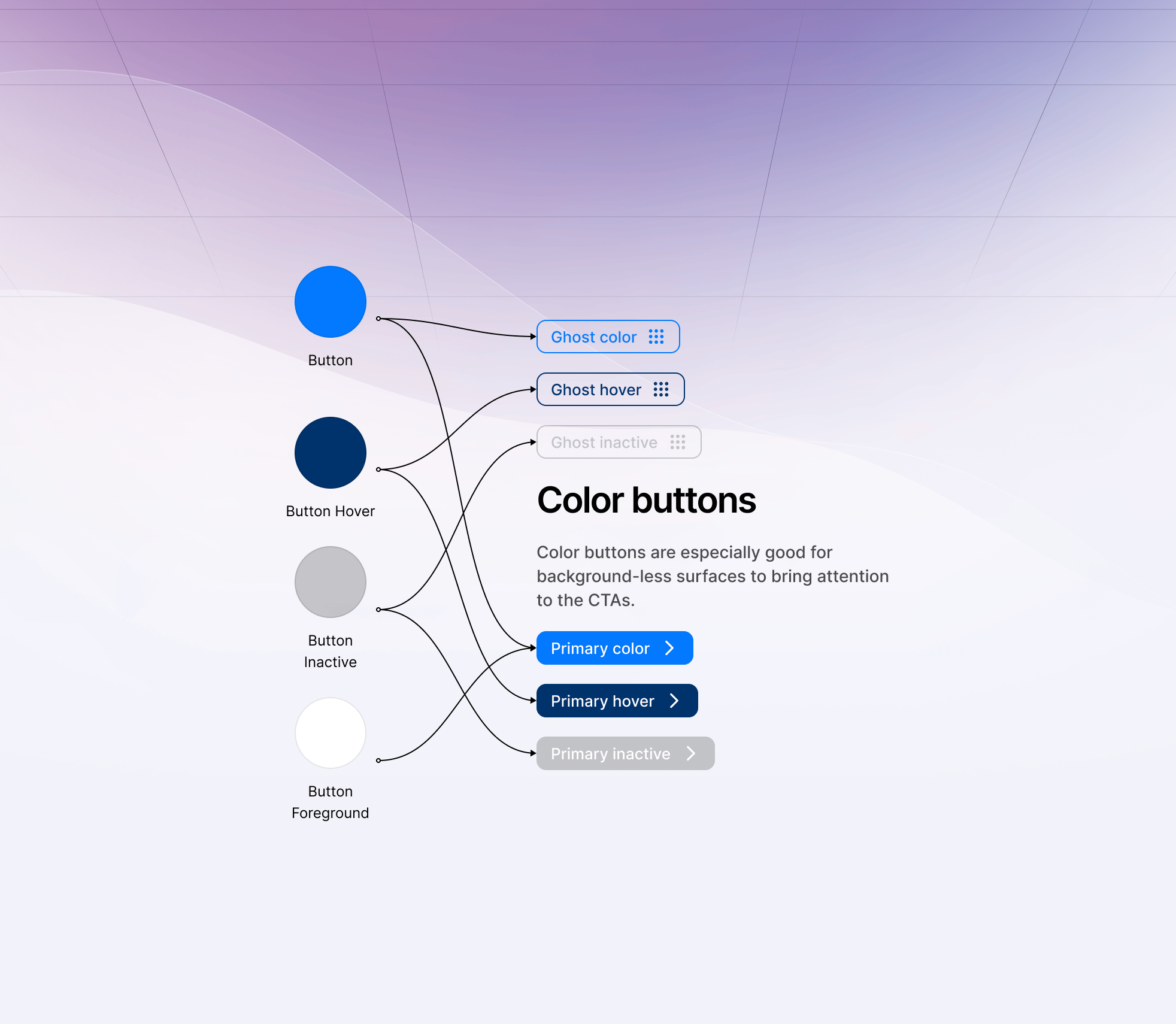
Button Colors: A vital part of interactive design, button colors include the button foreground (often the text color) and adapt to various states like hover, inactive, selected, and active. The primary color often dictates the button's base color, ensuring consistency across the design.
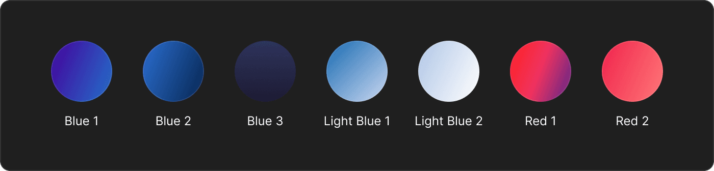
Background Colors: Serving as the canvas for your design, these are typically primary and secondary colors used across the entire screen. Popular choices include black, white, dark gray, and off-white, with variations like dark blue and light blue. They are pivotal in both light and dark mode settings, ensuring readability and aesthetic appeal in different lighting conditions.
Exploring Gradients in Figma Design
Gradients in Figma offer a dynamic way to enhance your designs, bringing an additional layer of depth and personality. They are typically used in specific design elements, such as backgrounds, card backgrounds, and button backgrounds. Here's a closer look at how gradients can elevate your design work:
Backgrounds and Card Backgrounds: Gradients add a subtle complexity to these elements, making them stand out without overwhelming the overall design.
Button Backgrounds: Using gradients here can create a sense of depth and make buttons more engaging and noticeable.
Ornamental Use: Gradients act like ornaments, injecting style and personality into designs. They are not just functional but also add an aesthetic flair.
Outlines and Glows: Gradients can be creatively used for outlines or to create a glowing effect, adding a unique touch to elements.
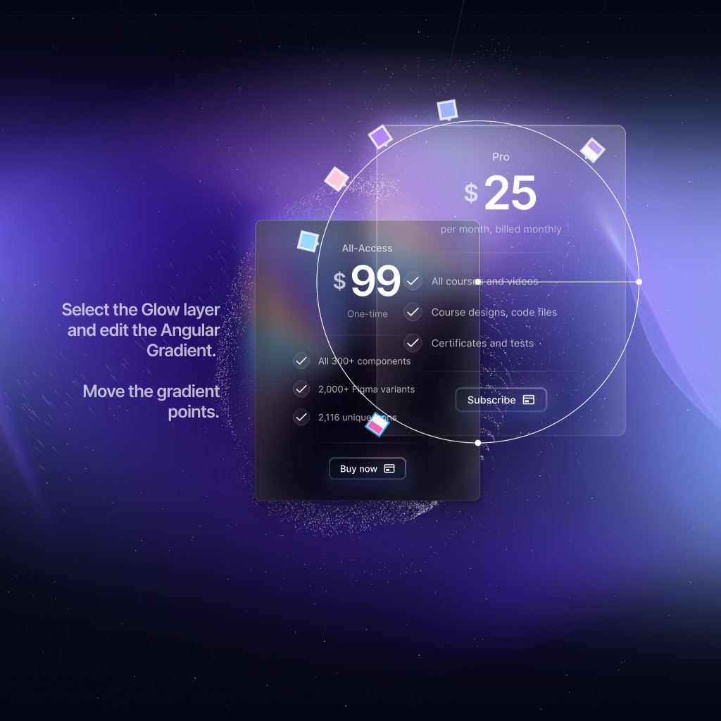
Angular Gradients: These are most commonly used for glow effects or as backgrounds with a blur effect. Angular gradients require careful handling, often needing a blur layer on top to look their best.
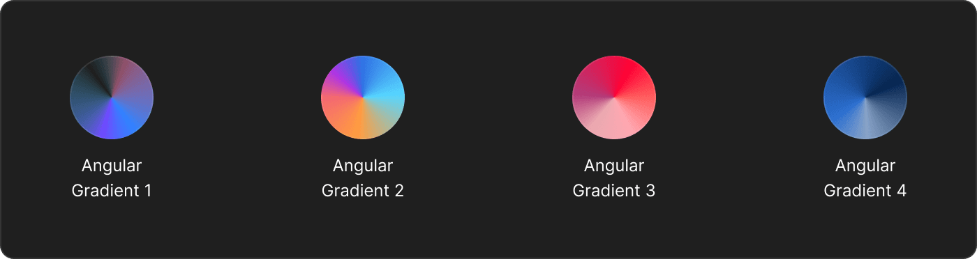
Radial and Linear Gradients: These are the more common types. Radial gradients are akin to linear gradients in their application but offer a different visual feel.
Diamond Gradient: Like angular gradients, diamond gradients also benefit from a blur layer for optimal aesthetics.
Use Sparingly for Uniqueness: While gradients can significantly enhance a design, they should be used sparingly. Overuse can overwhelm the design or make it look cluttered.
For Beginners: If you're not yet confident in using gradients, it's advisable to stick with existing templates and components. Gradients require a nuanced understanding of color and effect to be used effectively.
Incorporating gradients into your Figma designs can add a layer of sophistication and uniqueness. However, it's crucial to understand their impact and use them judiciously to maintain the balance and integrity of your design.
How to Use Colors in Design Systems
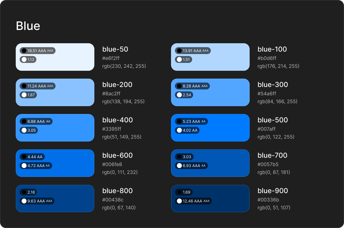
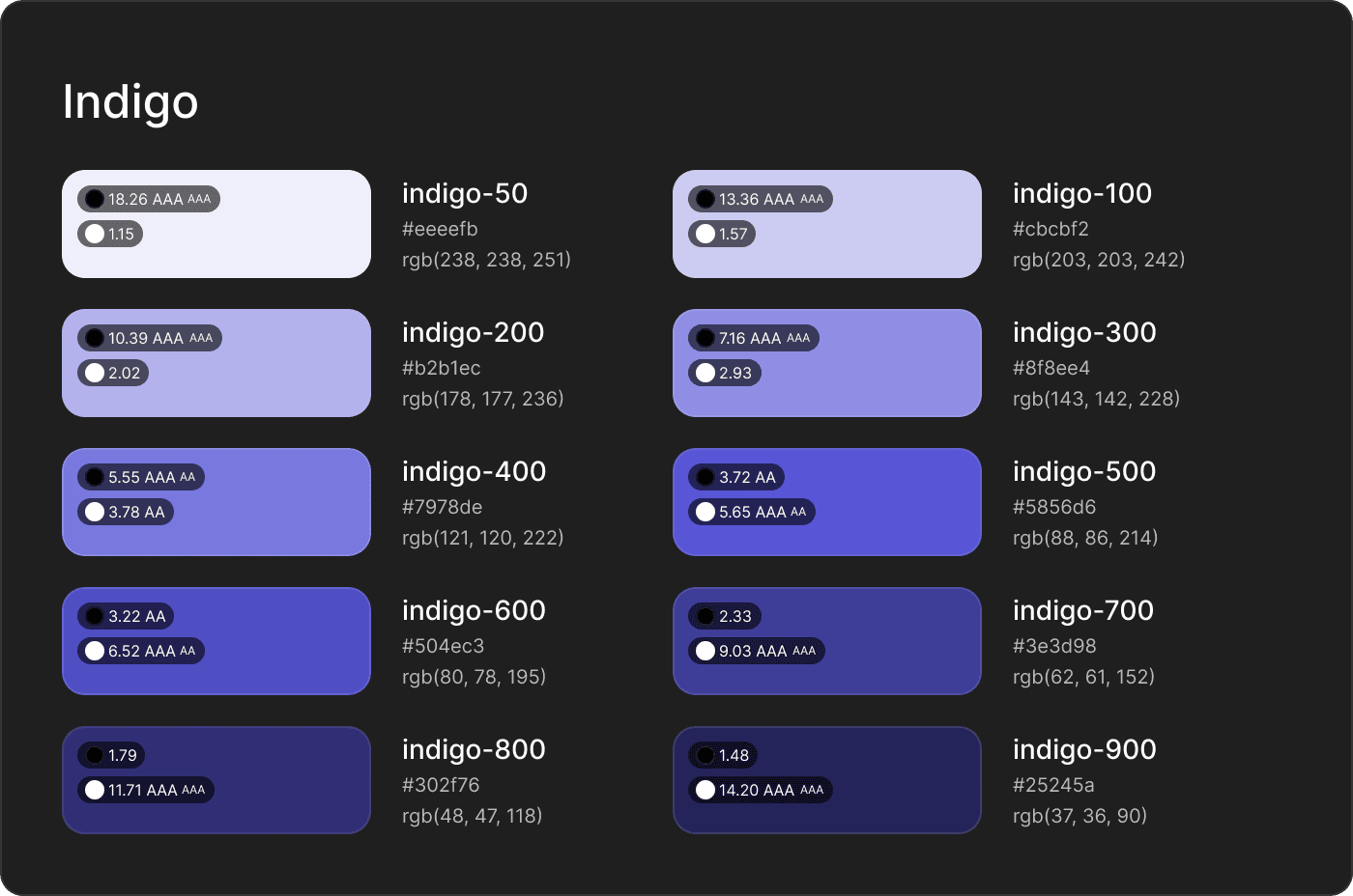
Primitives are the basic building blocks of your design system's color palette. These are the essential colors that define your brand and interface. Primitives usually include:
Primary Colors: The main color of your brand.
Secondary Colors: Supportive colors that complement your primary color.
Neutral Colors: Grayscale colors used for text, backgrounds, and UI elements.
Color Variables (or Design Tokens) are named entities that store color values. Instead of using direct color codes in your designs, use these variables. This makes it easier to maintain consistency and simplifies changes across your designs.
Setting Up Primitives in a Design System
Define Brand Colors: Choose a primary brand color and complementary secondary colors.
Create Shades: Develop a range of tints (lighter shades) and shades (darker versions) for each color.
Assign Meaning: Colors should have a clear role, like error (red), success (green), or warning (yellow).
Using Color Variables
Naming Conventions: Use clear, descriptive names for color variables, such as --color-primary or --color-background-light.
Apply Variables: Use these variables throughout your design instead of hard-coded color values.
Context and Colors
Contextual Use of Colors: Colors should change depending on their context. For instance:
Background Colors: Use lighter shades for backgrounds to reduce eye strain.
Interactive Elements: Use medium shades for buttons to make them stand out.
Text: Contrast is crucial. Ensure text colors stand out against their background for readability.
Tips for Working with Colors
Consistency: Stick to your defined color system for a cohesive design language.
Contrast: Always check for enough contrast, especially for text, to ensure accessibility.
Cohesion: Ensure colors complement each other, creating a visually harmonious interface.
Advanced Techniques
Gradients: For a modern look, experiment with gradients, but use them sparingly to maintain a professional appearance.
Opacity and Blends: Use these to create depth and layering in your interface.
Summary
A design system’s color palette should start with a set of primitives — your primary, secondary, and neutral colors. Turn these into color variables for easy reference and application across your design. Use these colors contextually to convey meaning and ensure accessibility. Maintain consistency in your designs by sticking to the color system, and always ensure sufficient contrast for readability. Experiment with advanced techniques like gradients and blends to add depth to your design.
Color Contrast in Figma for Accessibility and Readability
In the realm of design, particularly when working in tools like Figma, it's crucial to ensure that your content is not only aesthetically pleasing but also accessible and easy to read. A key component in achieving this is understanding and effectively applying color contrast.
Importance of Contrast Ratio: A strong contrast ratio is essential for making design elements, especially text and icons, stand out against their backgrounds. It significantly affects legibility and clarity.
Contrast Ratio Range: The contrast ratio ranges from 1 to 21. A ratio of 21:1 represents the highest contrast, such as black text on a white background, while 1:1 indicates no contrast, like white text on a white background.
Using Figma Plugins for Contrast: Tools like the Foundation Color Generator and Stark can be immensely helpful in Figma. They allow designers to select a foreground element (like text or an icon) and compare it against the background, providing a contrast ratio value.
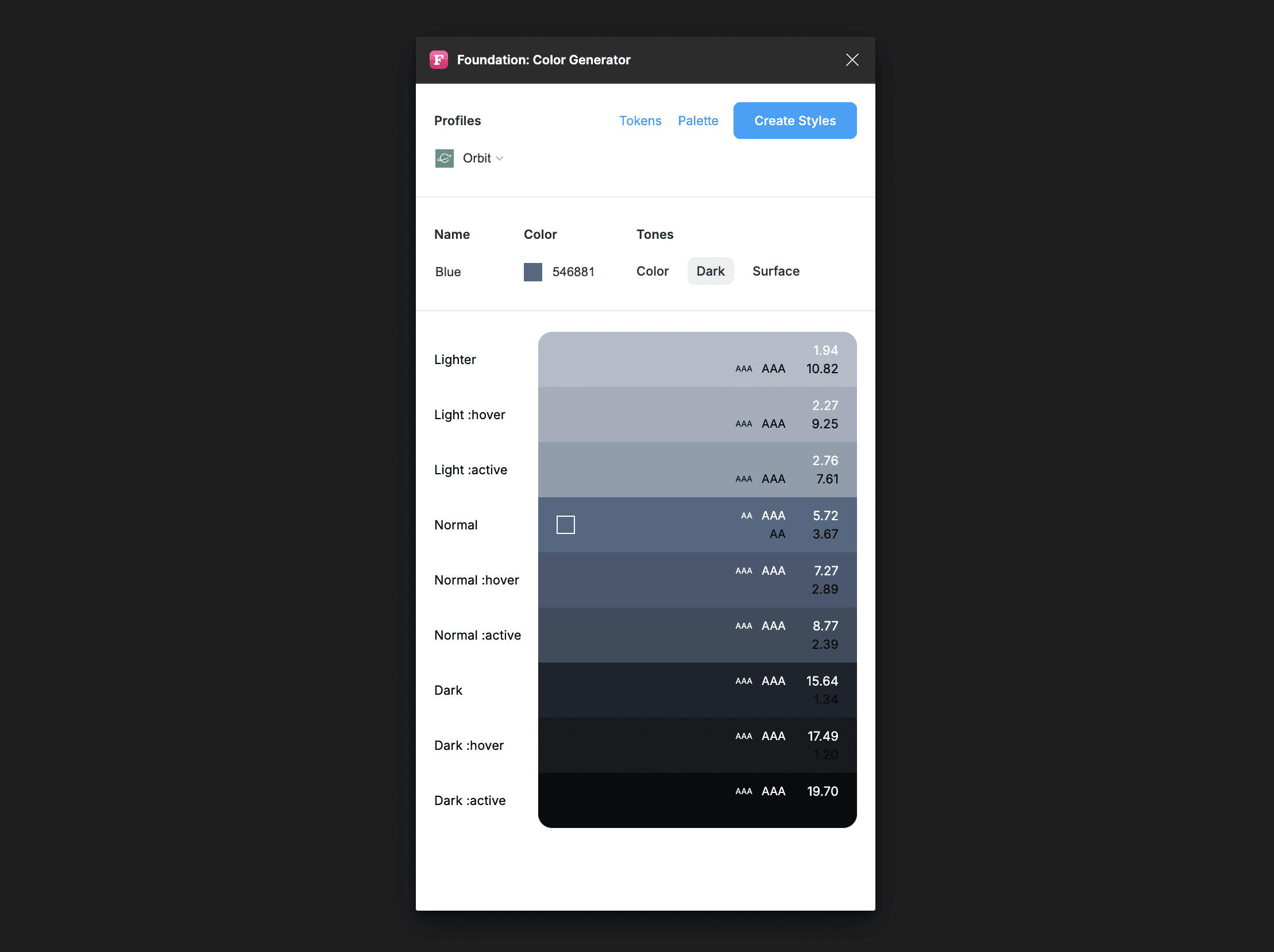
Standards for Contrast Ratios: According to the Web Content Accessibility Guidelines (WCAG), the minimum contrast ratio for AA level is 4.5:1 for normal text and 3:1 for large text. For the higher AAA standard, the ratios are 7:1 for normal text and 4.5:1 for large text.
Targeting Higher Contrast Ratios: While a contrast ratio of 3:1 meets the AA requirement for large text, it falls short for normal text. Therefore, aiming for higher contrast ratios, preferably at the AAA level, ensures better accessibility and readability for a broader audience, including those with visual impairments.
ColorStyles and Variable Colors in Figma: When working with ColorStyles and variable colors in Figma, aim to pair colors against black or white to achieve a high contrast ratio. This practice not only enhances the visual appeal of your design but also ensures it is accessible to as many users as possible.
By prioritizing high contrast ratios in your designs, you enhance the overall user experience, making your designs not only visually appealing but also accessible and inclusive.