Shadows and Blur Styles in Figma
Shadows and blur styles are two fundamental design elements that play a crucial role in enhancing the aesthetic appeal and functionality of user interfaces (UI). Their effective application can transform a flat, two-dimensional design into a more dynamic and engaging interface. Both elements serve to create depth, draw attention, and improve the user experience by making interfaces more intuitive and visually appealing.
How to add Blurs and Shadows
Select an element and go to Effects and click on the Style icon (4 small circles).
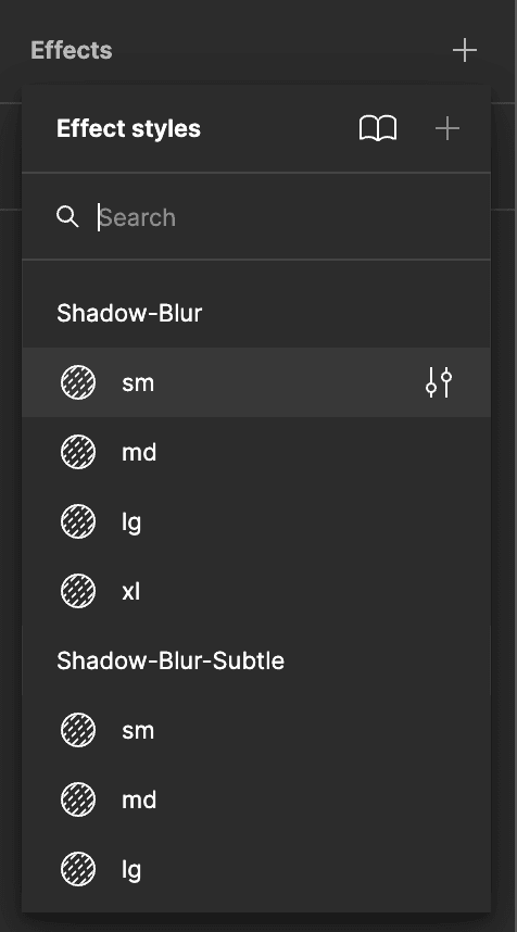
Understanding Drop Shadows in our UI Kit
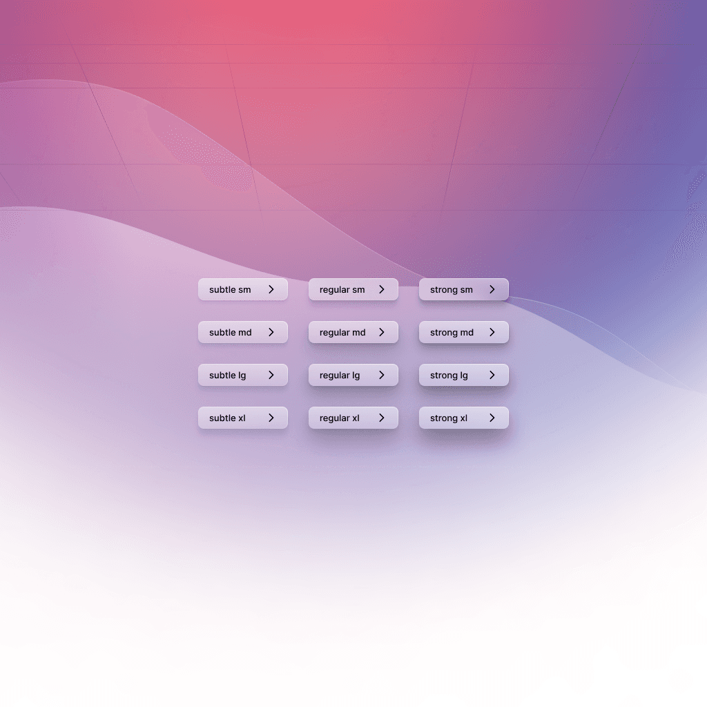
Design Style
Choose from three shadow styles: normal, subtle, and strong.
Select based on the visual impact you desire; subtle for minimal depth, strong for pronounced elevation.
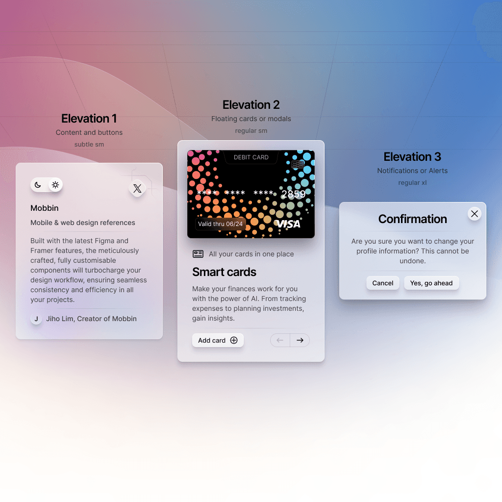
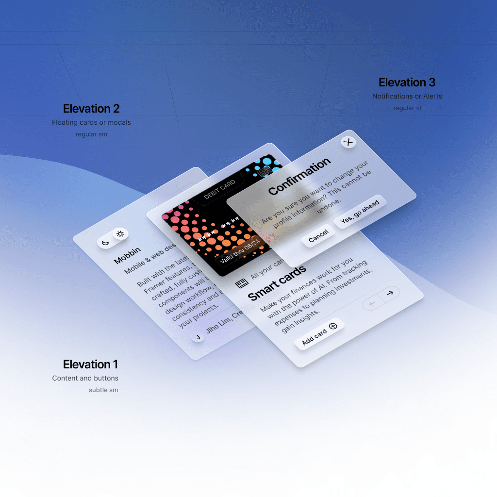
Element Elevation
Consider the layering of elements; modals are higher than buttons, cards stack atop content.
Match shadow strength to elevation level; higher elements typically warrant stronger shadows.
Simplified System
Each shadow style is crafted from three smaller shadows for a sophisticated effect.
Our presets eliminate the need to adjust shadow parameters manually, streamlining the design workflow.
Shadows are consistent between Light and Dark Mode, although in Dark Mode, glow can be used more prominently.
Use this system to enhance your design efficiently, without the hassle of extensive customization.
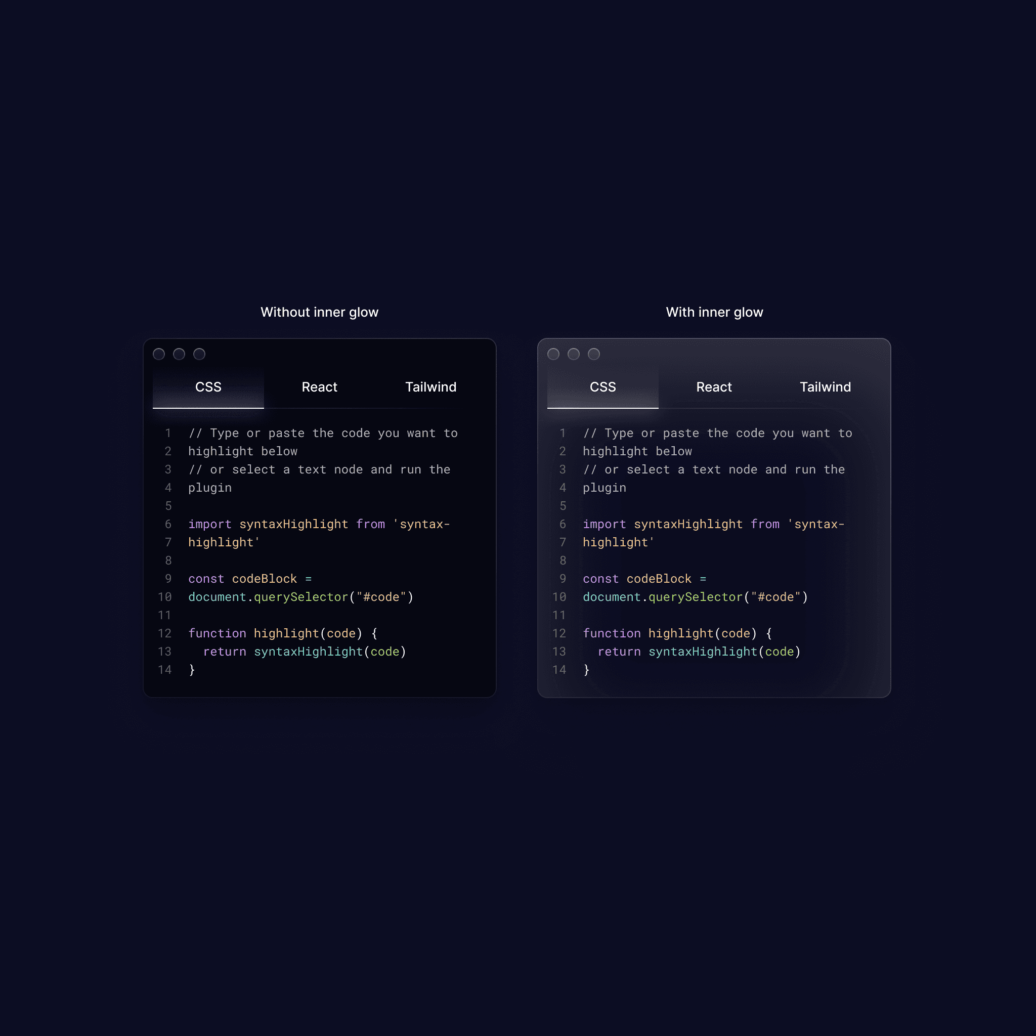
Shadows / Inner Glow in Dark Mode
In dark mode, traditional shadows (darker than the element they're cast from) can be less noticeable or even invisible, as they blend into the dark background. This makes it challenging to use shadows to create depth and separation between elements.
Purpose of Inner Glow
Inner glows can be particularly effective in dark mode for creating a sense of depth. They are used to subtly highlight an element's edges, making it stand out from its background.
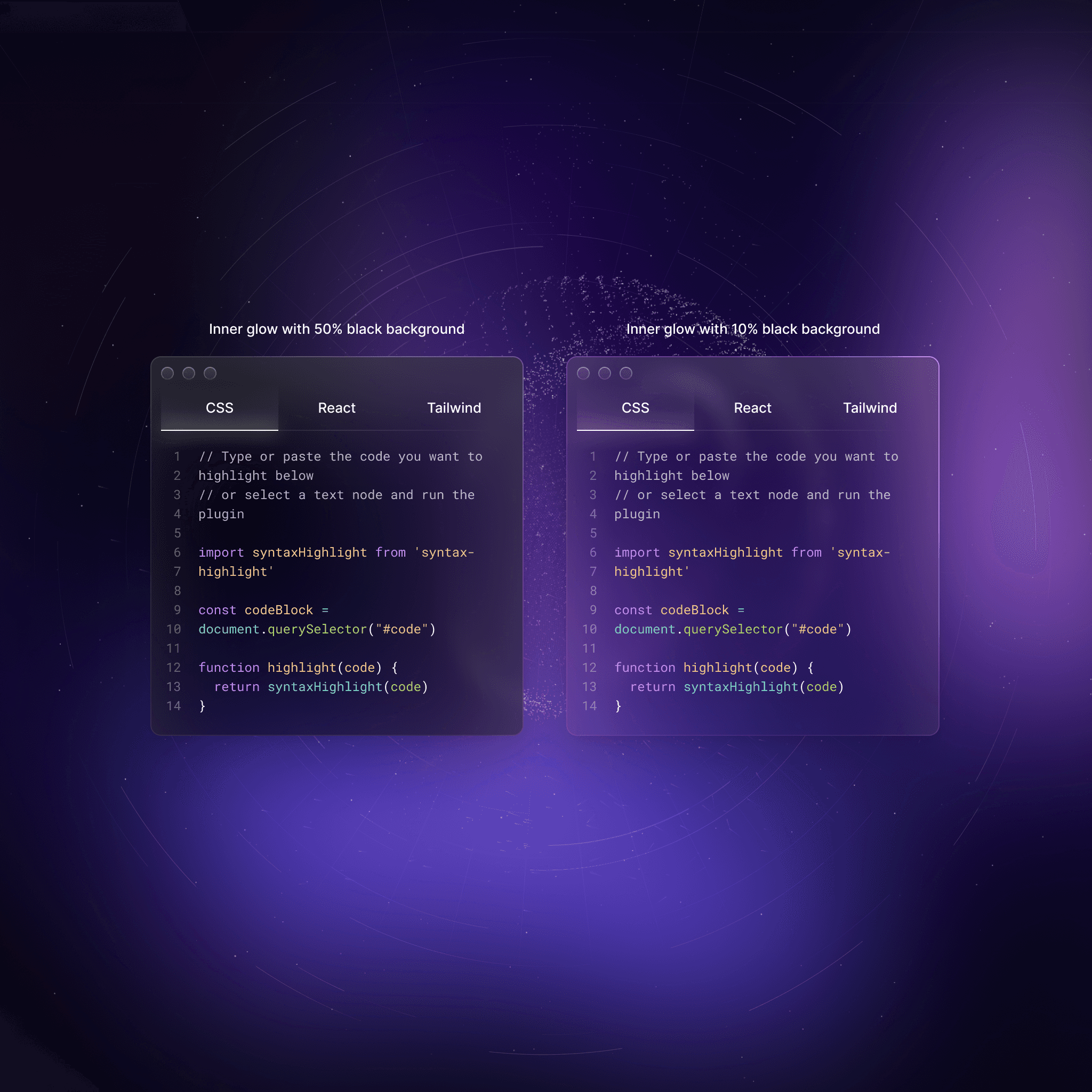
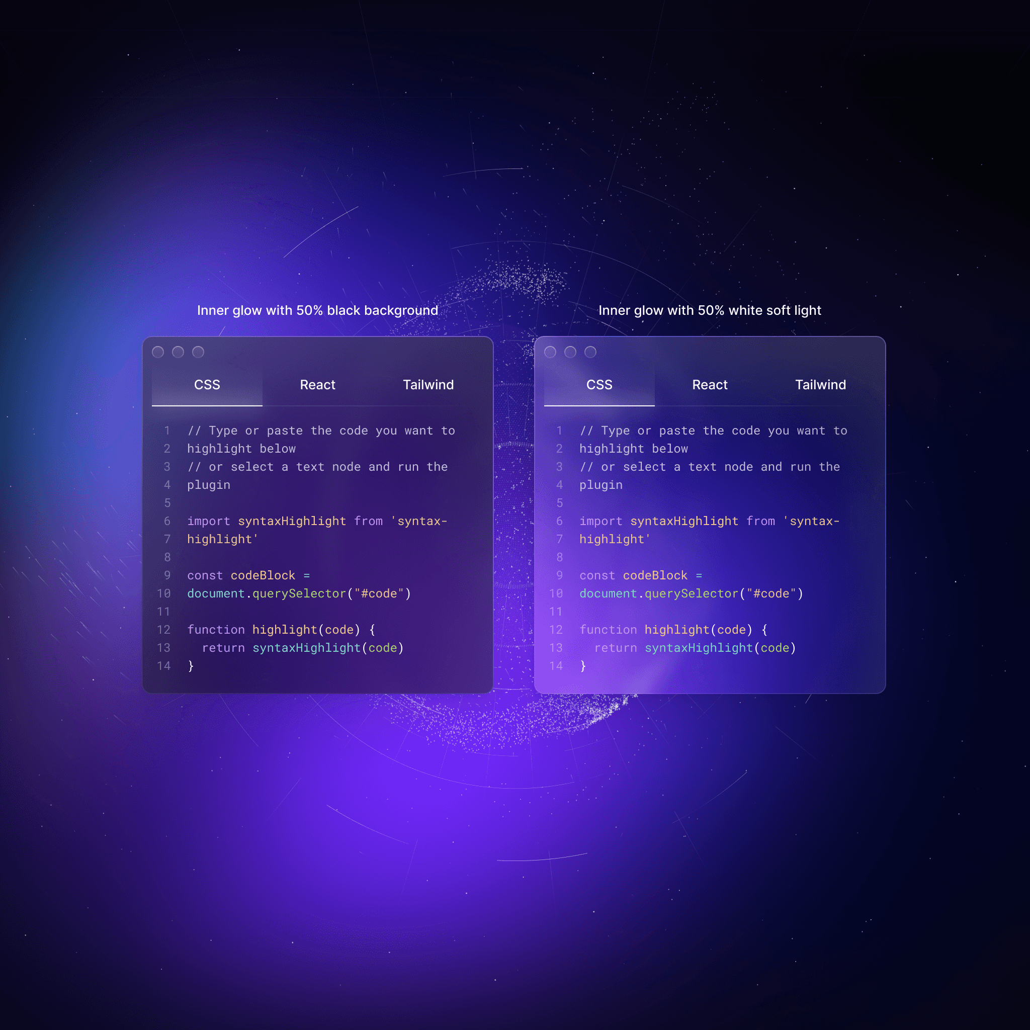
Application
Inner glows are usually applied to the inner edges of UI elements, such as buttons or input fields. They are generally softer and more diffused compared to shadows. The color of the glow is often a lighter or contrasting shade relative to the element's color, providing a gentle lift from the dark background.
Enhancing Focus and Interactivity
Inner glows are not just for aesthetic purposes; they can also enhance user interaction. For example, adding a slight inner glow to a button upon hover can indicate interactivity, guiding users on where to click.
Balance and Contrast
Maintaining the right balance of light and dark elements is crucial. The shadows and glows should create enough contrast for elements to be distinguishable, but not so much that it disrupts the overall visual harmony.
Consistency
Apply shadows and inner glows consistently across similar elements to maintain a cohesive look and feel throughout the interface.
Accessibility
Ensure that the addition of these effects does not compromise the readability or usability of the interface. Text and important elements should remain legible and accessible to all users.
In summary, when designing for dark mode, the creative use of lighter shadows and inner glows can effectively create depth and emphasize key elements, enhancing the user experience while maintaining the sleek and muted aesthetic that users often associate with dark-themed interfaces.