Spacing Variables and Rules
Just like a color scale, employing a defined spacing system accelerates your workflow and promotes consistency across designs. Adopting the 8-pt soft grid system eliminates guesswork during both the design and development phases, as it offers a limited and systematic set of spacing options.
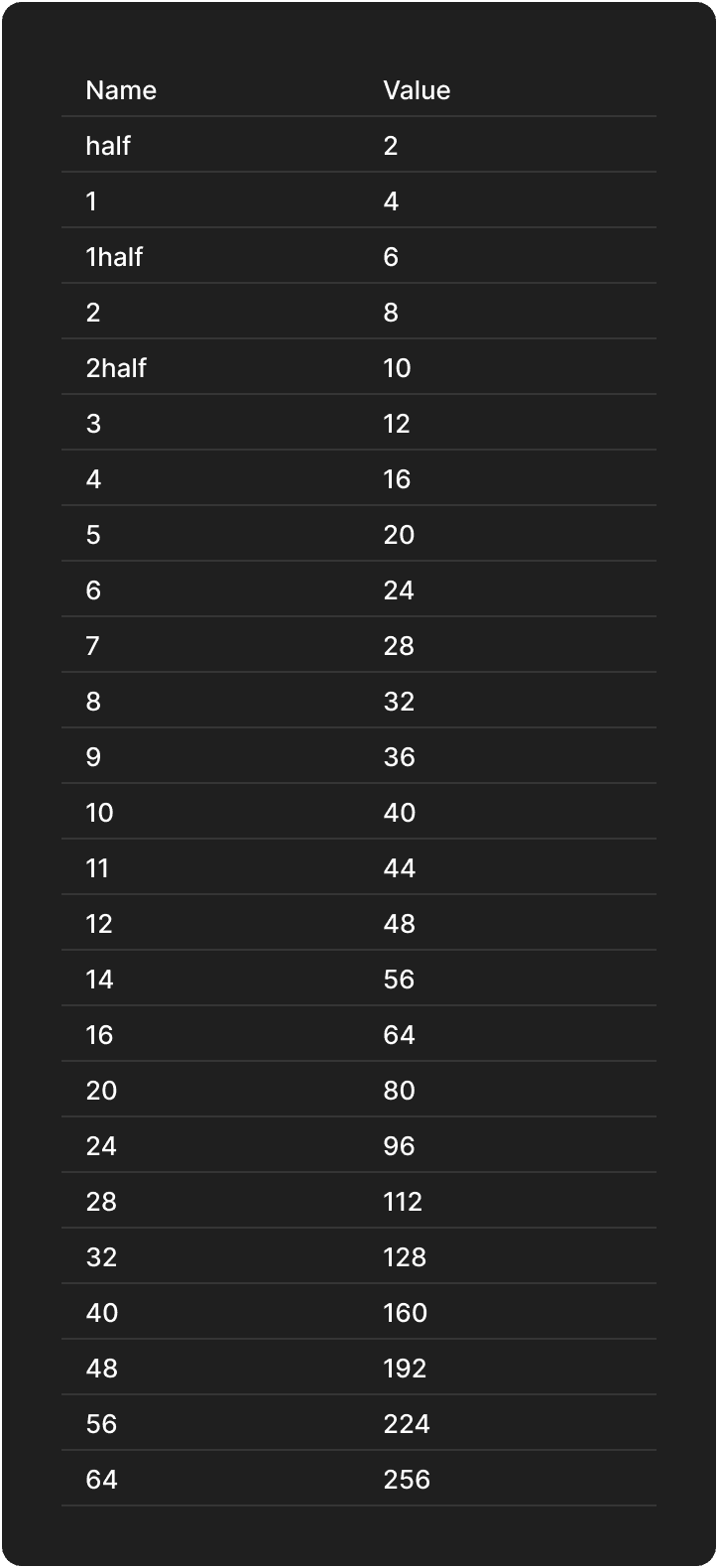
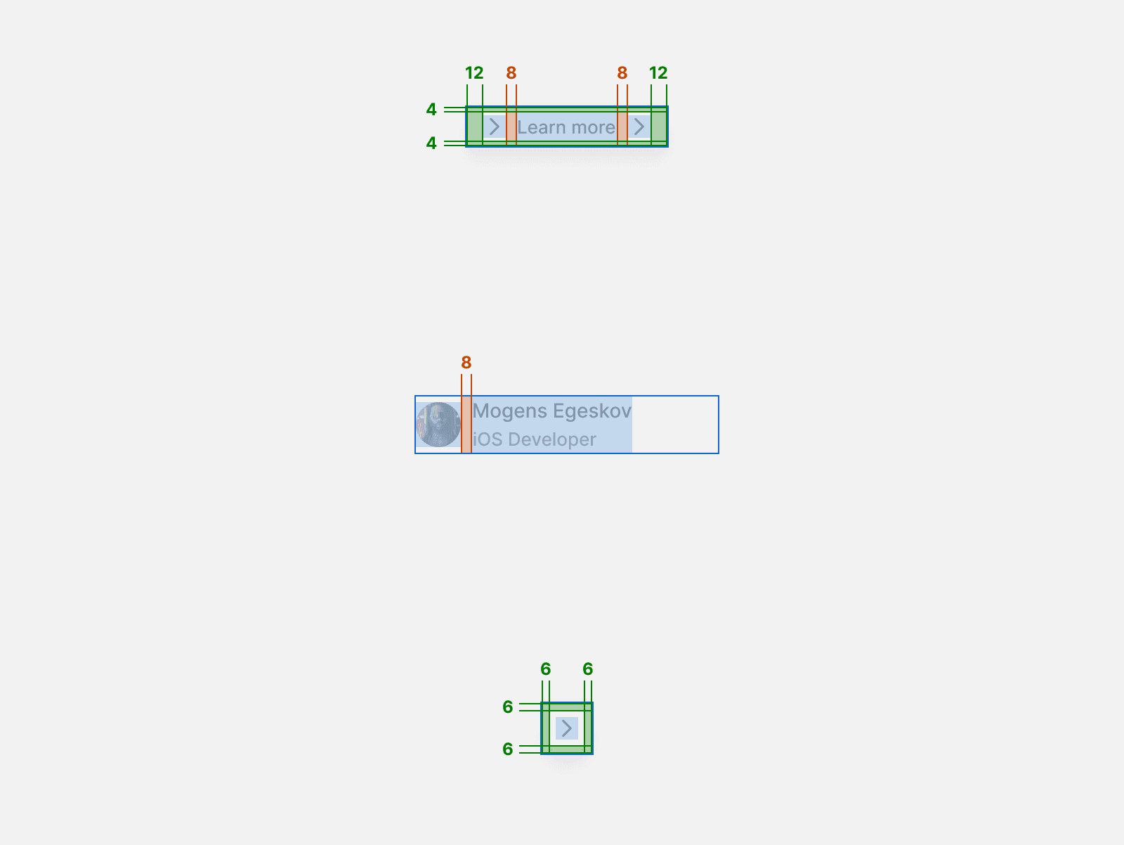
4-pt grid
Halves for Fine-Tuning: Between 0 to 5, utilizing halves can fine-tune button paddings, ensuring optimal visual balance. For most other instances, prefer full numbers for clarity and simplicity.
Granularity with Care: While it's possible to achieve finer granularity in spacing between grouped elements, it often necessitates additional containers. Remember, as designers and developers, our goal is to strike a balance between precision and minimalism to maintain an efficient workflow.
Whenever you're deciding on spacing — be it margins, padding, or gaps — refer to this list. It's designed to provide uniformity, streamline your decisions, and maintain a consistent visual rhythm throughout the interface.
Implementing the Grid System
The 4-point grid system is a versatile tool for creating a cohesive, consistent layout in design. It's based on increments of four to create harmony and balance.
Base Unit: Start with a base unit of 4 points. This will be the foundation for all spacing and layout measurements.
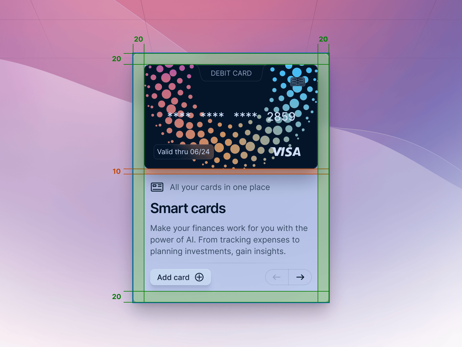
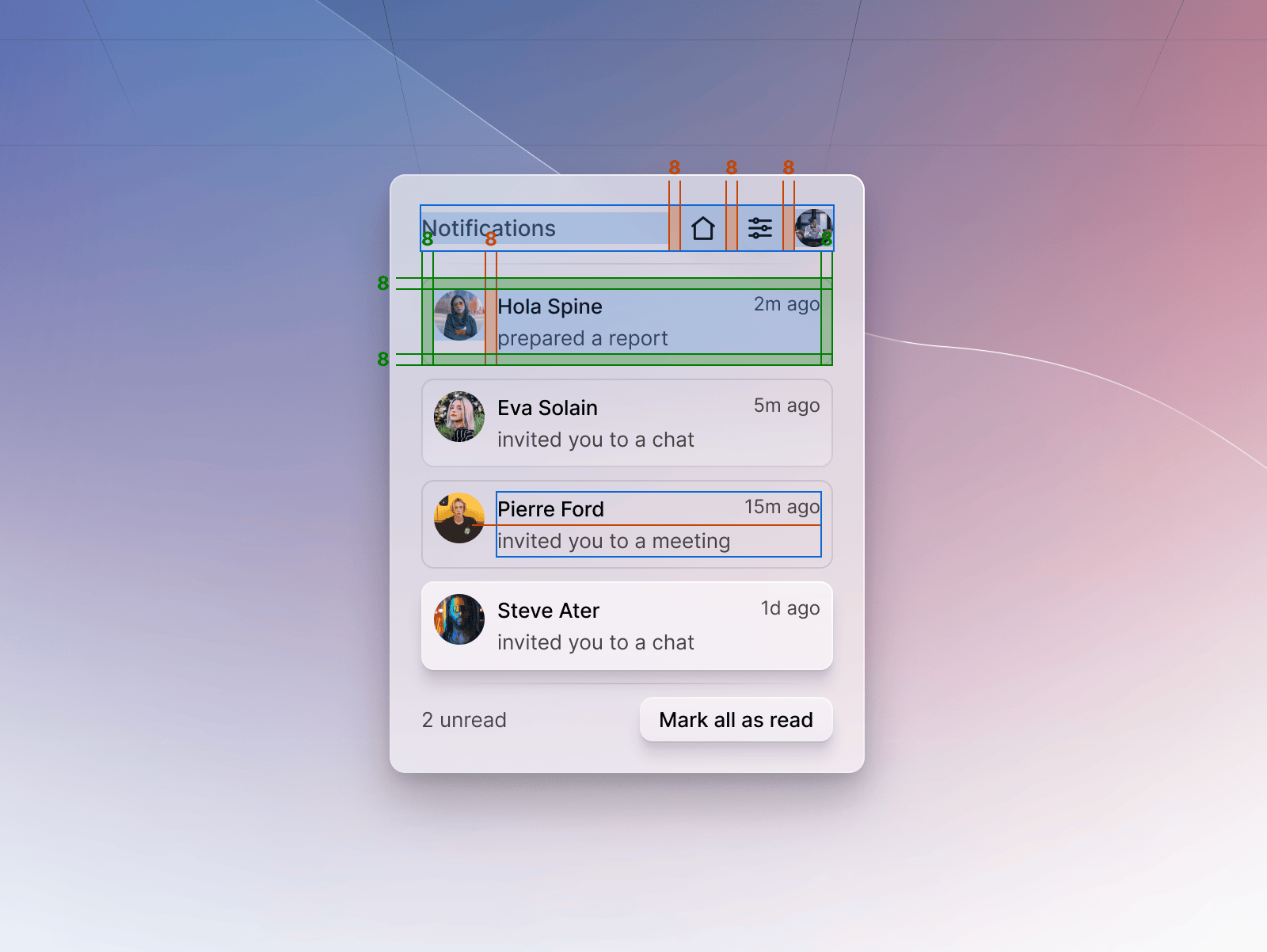
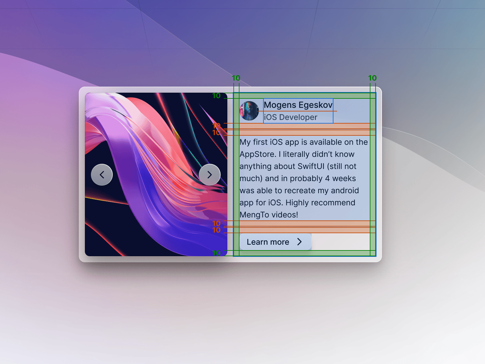
Containers: Use multiples of 4 (8, 16, 32, etc.) for padding within containers to ensure elements are aligned and uniformly spaced.
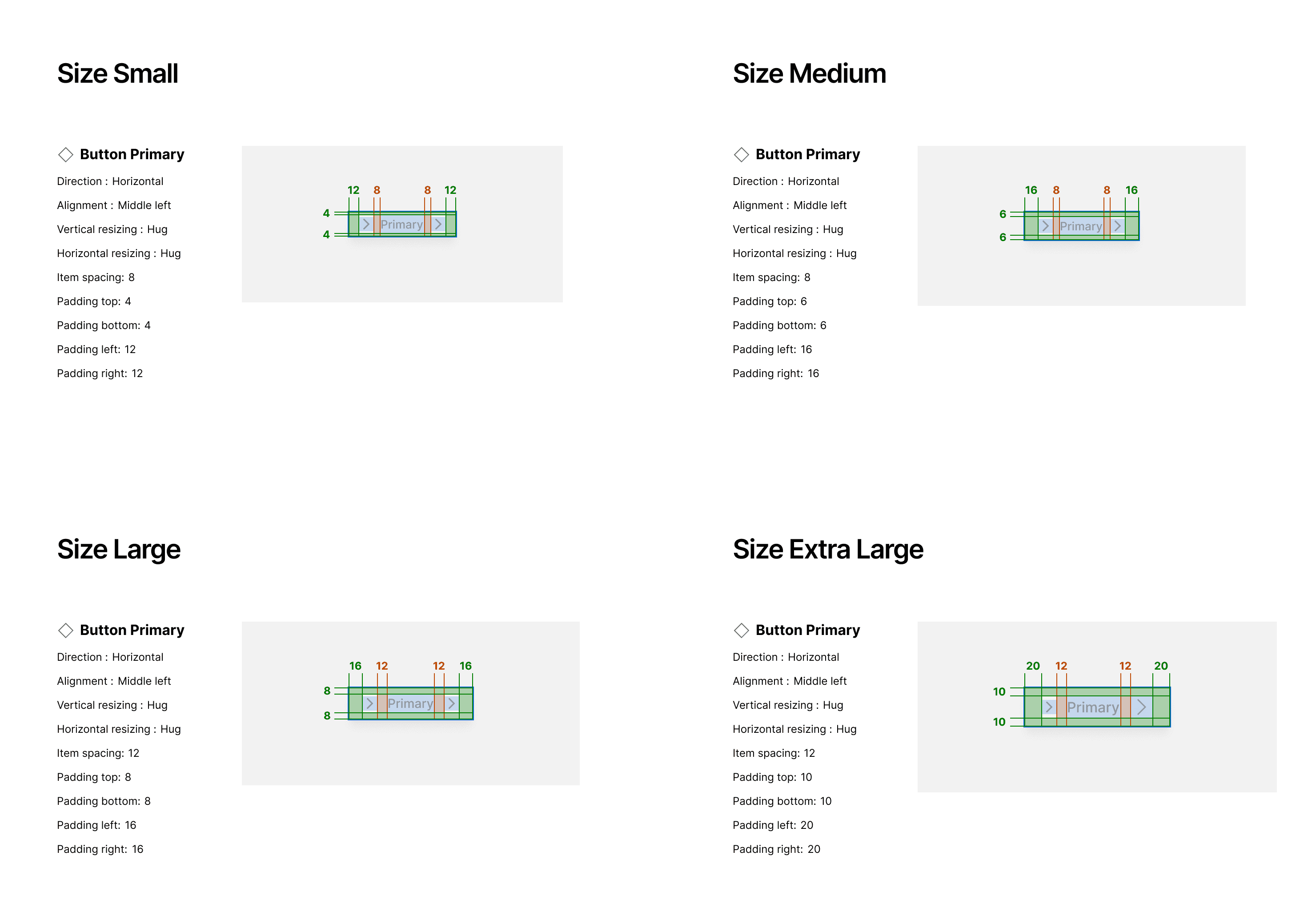
Elements Sizing: Apply the grid to the sizing of elements, ensuring buttons, icons, and form fields adhere to the multiples of 4.
Using Halves for Precision
When finer control is needed, particularly for smaller components like buttons, you can use half values (2 points) to get the perfect spacing without breaking the grid system's rhythm.
Proportions Depending on Element Size
Small Elements: Use smaller grid units (e.g., 4, 8 points) for spacing around text fields, buttons, and icons.
Large Elements: Increase the grid unit for larger elements like cards or modal windows to maintain proportional spacing (e.g., 16, 32 points).
Gaps and Auto Layout
Auto Layout: Use auto layout functions to automatically apply the grid system within components. This ensures consistent spacing as elements resize or adjust.
Gaps: Define gap properties between elements based on the 4-point grid, ensuring consistent space within lists, grids, or stacks of components.
Variables for Different Elements
Create spacing variables that can be applied to different elements. For example, --spacing-small could be 8 points, while --spacing-large could be 32 points. Use these variables consistently across your design.
Primitives and Spacing
Primitives: Define primitives for your spacing just like you do for colors. These are the smallest units from which all spacing is derived.
Consistent Application: Apply these primitives consistently across all UI elements to maintain a coherent visual structure.
Practical Application
Hierarchy: Larger spacing for larger elements enhances visual hierarchy.
Readability: Adequate spacing between text lines improves readability.
Responsive Design: Use variable spacing for different screen sizes. For example, a desktop layout may have more generous outer margins than a mobile screen.
Accessibility: Consider the touch targets for interactive elements, ensuring they are spaced appropriately for usability.
Summary
By leveraging the 4-point grid system and its divisible units, designers create a rhythm that's visually pleasing and functionally robust. Spacing primitives become a core part of the design system, allowing for a modular approach to layout construction. Auto layout features further streamline the design process, ensuring consistency across different screens and devices. Use spacing variables judiciously to ensure elements are neither too cramped nor too spread out, respecting the overall design's balance and user needs.
Understanding Breakpoints
What Are Breakpoints?
Breakpoints are specific pixel values that define how the layout of web content should adapt to different screen sizes, ranging from mobile devices to large desktop monitors. They're a cornerstone of responsive design, ensuring that an application or website remains accessible, legible, and usable across all devices.

Setting Breakpoints
Common Breakpoints: Start with industry-standard breakpoints. Common sizes include:
Mobile (small screens): 320px, 375px, 480px
Tablet (medium screens): 600px, 768px, 1024px
Desktop (large screens): 1280px, 1440px, 1920px
Content-Driven Breakpoints: Instead of, or in addition to standard sizes, consider where your content naturally breaks. Adjust layouts when the content requires, not strictly by device dimensions.
Using Breakpoints in Design Systems
Variables: Create variables for your breakpoints, such as --breakpoint-mobile, --breakpoint-tablet, --breakpoint-desktop.
CSS Media Queries: Use these variables within media queries to apply different styles at each breakpoint, ensuring content scales and rearranges effectively.
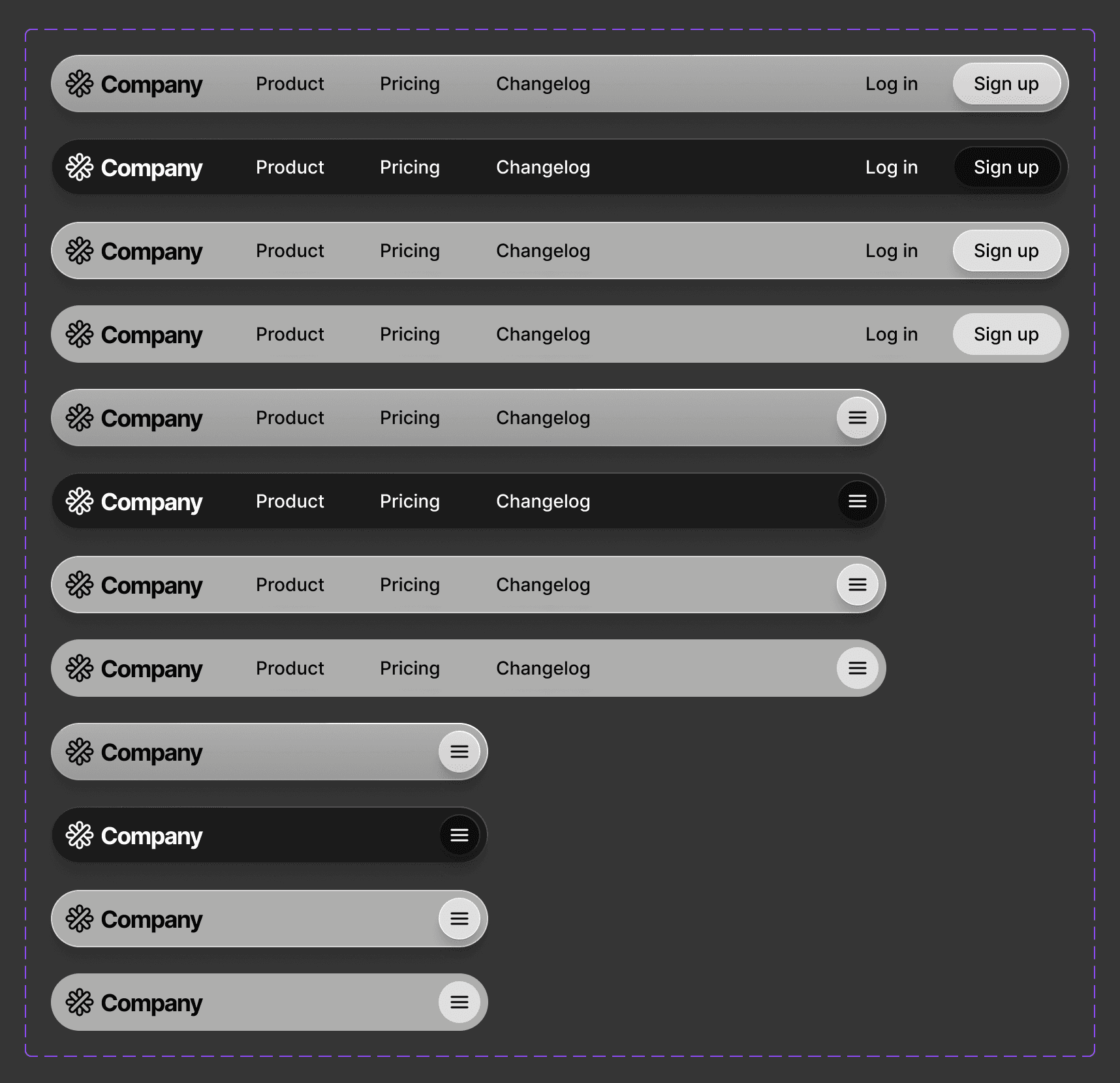
Component Variants: Design components with variations for each breakpoint, adjusting padding, margins, and font sizes to fit different screens.
Breakpoints and the 4-Point Grid
Consistency Across Breakpoints: Maintain the 4-point grid system across breakpoints. Adjust grid units in multiples of four to ensure consistency while scaling up or down.
Proportional Scaling: As you move from smaller to larger breakpoints, scale spacing proportionally. A padding of 16px on mobile could scale to 32px on desktop.
Auto Layout and Breakpoints
Fluid Containers: Use auto layout to make containers and elements stretch and shrink between breakpoints.
Min/Max Sizing: Set minimum and maximum widths for elements to ensure they don't become too narrow or too wide at different breakpoints.
Breakpoints and Accessibility
Touch Targets: At smaller breakpoints, ensure touch targets are large enough (at least 44px by 44px) for comfortable interaction.
Readable Text: Scale text sizes at different breakpoints to ensure legibility. Text that's readable on a desktop may be too small on mobile.