Friday, October 27, 2023
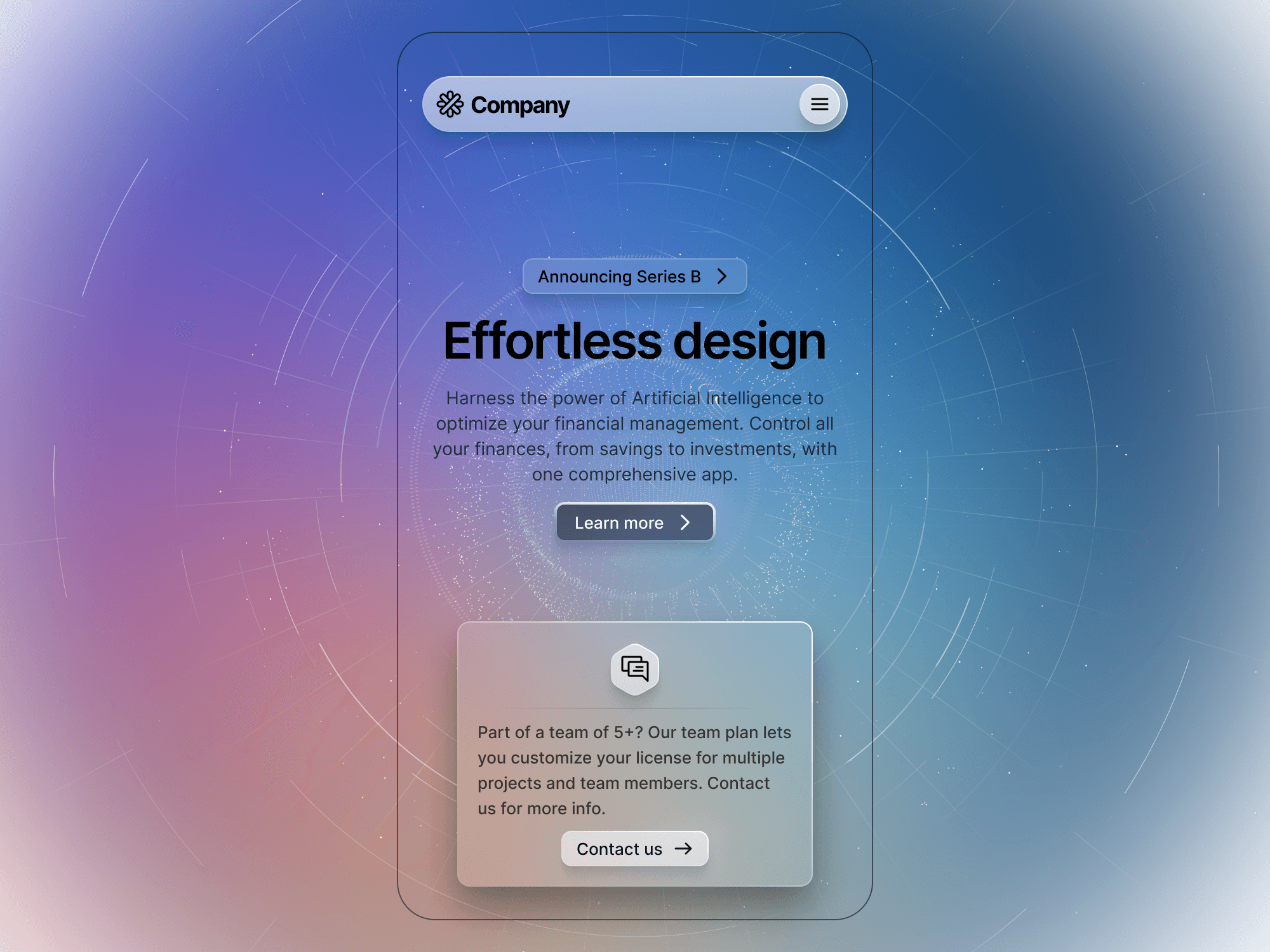
In this update, we introduce breakpoints. This feature effortlessly transitions between desktop, tablet, and mobile views. If a component is too large or small for a particular device, breakpoints will map the correct instance, ensuring optimal design adaptation across different screen sizes through component properties.

Meng To, designer and coder
