Thursday, November 9, 2023
Design systems are vital for creating uniformity and efficiency in digital product design. In the realm of user interfaces, buttons are ubiquitous components that facilitate user actions. This comprehensive tutorial will guide you through the nuances of crafting a versatile and reusable button within your design system, ensuring consistency and functionality across your projects.
Setting Up Your Button Page
When it comes to organizing your design system, it is crucial to allocate a specific area dedicated to your button designs. This can be done in two ways:
Creating a New Template: Design a new page from scratch, specifically for buttons. This allows for complete customization and focus on button-related elements.
Selecting a Page within Your Design System: Choose an existing page that can be repurposed to showcase your buttons. Name this section "Buttons" for clear reference.
This page will serve as the central hub for all button-related designs, acting as a reference point for the design and development teams.
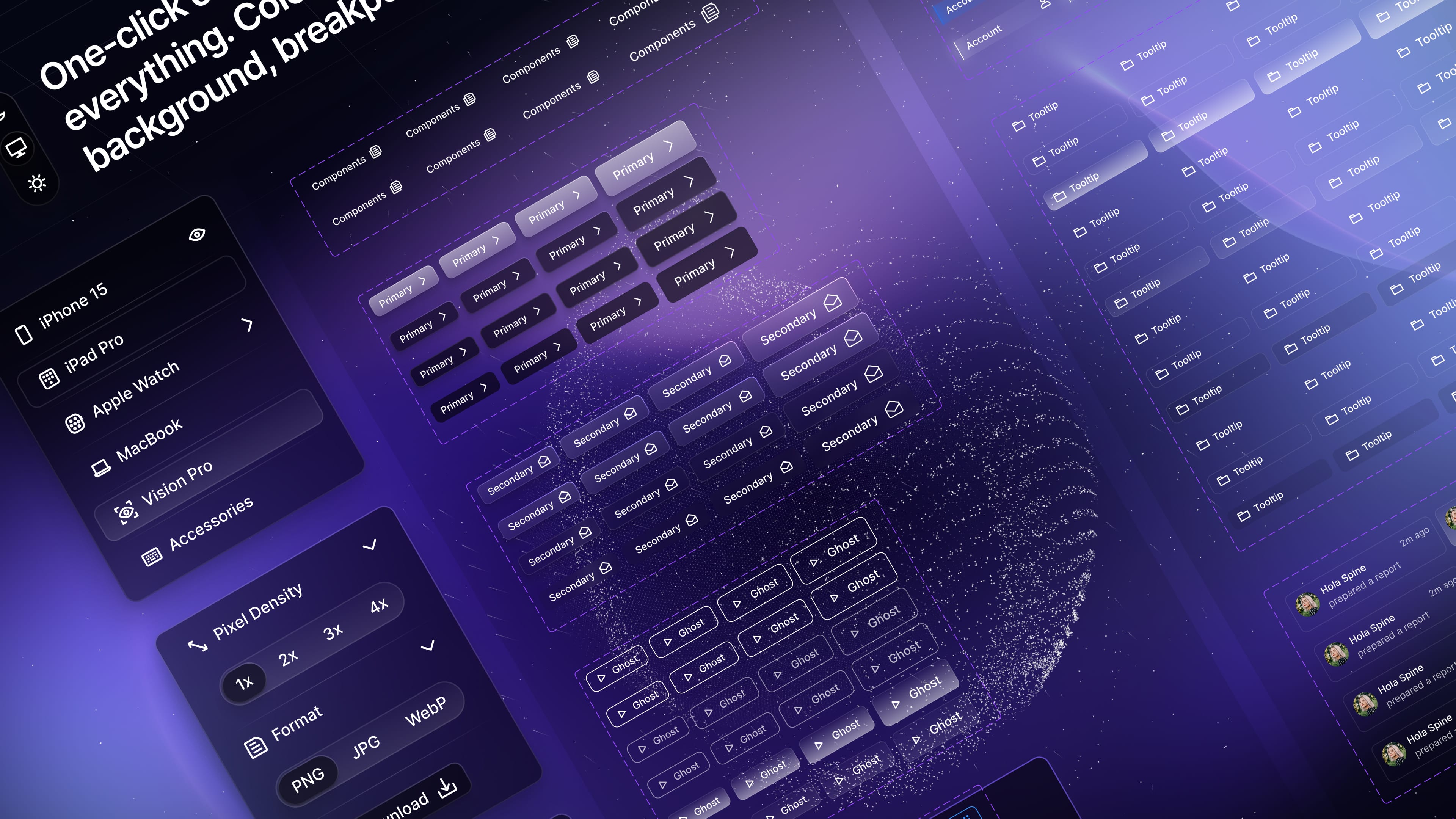
Organizing Your Buttons
The organization of your buttons is a balancing act between simplicity and the need for different styles. Here's how to manage your button variants:
Minimal Variants: Start with a base set of button styles to cover most of your needs. This might include a primary button, a secondary button, and a tertiary style.
Categorization: Group buttons by their function, like 'Call to Action', 'Form Submission', or 'Navigation'.
Complexity Management: For more complex designs, create additional variants carefully. Each new style should serve a distinct purpose and not overlap with existing ones.
Crafting the Button
Add Text to Your Button:
Text is a critical element of any button, conveying its function. Here’s how to add and style text:
Text Tool: Use the text tool (T) to type out the label for your button.
Text Styles: Apply the "Body" text style from your design system. Choose between "Regular" and "Medium" font weights to convey the appropriate level of prominence.
Incorporate an Icon:
Icons can enhance the usability of buttons by adding visual cues. To add an icon:
Insert Icon: Use the shortcut (Shift + I) to place an icon onto your button.
Icon Library: Select from your design system’s library for consistent iconography. For example, a "chevron right" can indicate forward movement.
Set Colors and Styles:
Colors play a significant role in button design, affecting visibility and user interaction. When setting colors:
Adaptability: Choose color variables that adapt to different themes, like light and dark modes.
Consistency: Stick to your design system's palette to maintain visual harmony across your product.
Using Auto Layout:
Auto layout streamlines the design process. Here’s how to use it:
Auto Layout Feature: Combine text and icon with auto layout (Shift + A), which allows elements to adjust automatically based on content.
Adjustments: Fine-tune padding and gaps to ensure the button's text and icon are aligned and balanced.
Component Properties:
Components increase reusability and consistency. Convert your design into a component:
Component Conversion: This allows you to reuse the button with different labels or icons without redesigning it.
Property Definition: Set up properties for text and icon modifications, enabling easy updates and variations.
Testing Your Button
Once your button is crafted, it's time to test it:
Contextual Testing: Place your button in various designs to ensure it works well in different scenarios.
Refinement: As your design system evolves, continually refine your button to ensure it remains functional and aesthetically pleasing.
By following these detailed steps, you will create a button that is not only visually consistent with your design system but also flexible enough to be used in various contexts. Remember, a well-designed button is more than an attractive element; it is a crucial tool that aids user interaction, driving your product’s usability and success.

Meng To, designer and coder