Wednesday, November 1, 2023
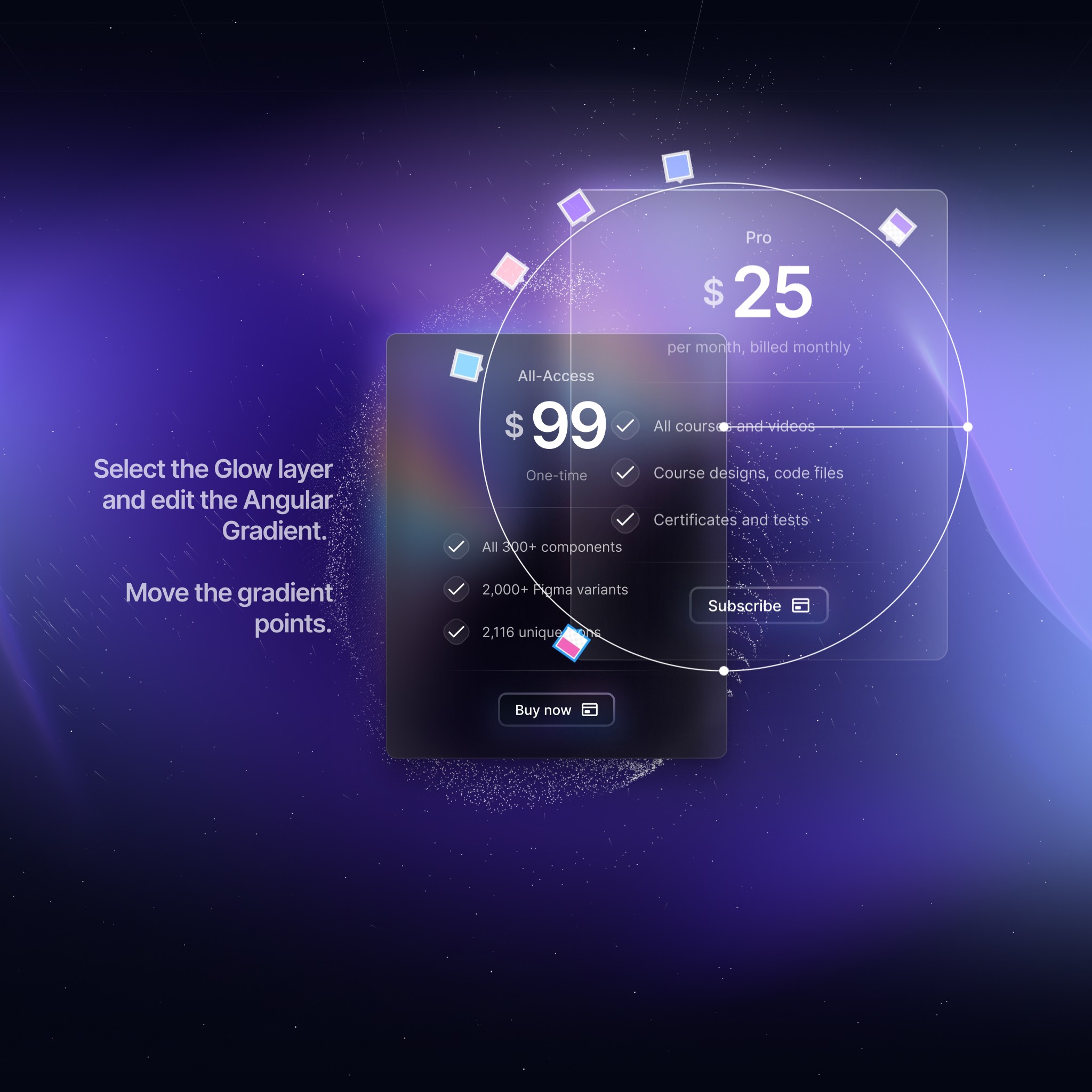
What makes DesignCode UI unique is its theming. The aesthetic is unmistakably different and personal. The background sets the mood, the glass absorb the colors and the shadows elevate. Despite that, it’s super flexible. Here is how you can switch between light and dark mode, and adjust styles:
Select the “DesignCode UI” frame and in the Inspector / Layer, select the Style and Colors that you want. Select Dark and booooom! This works on every single component! Please note that Style should be selected before Mode. That’s because Dark Mode is only explicitly created for Glass. The rest uses Variables.
Choose between three styles: Glass, Outline, and Flat.
Glass: Utilizes gradients and drop shadows.
Outline: No gradients, only outlines.
Flat: Neither outlines nor drop shadows.
Theming is available for individual component, including nested ones.
All styles use a blurred layer, making them versatile for any background. This is useful for various applications, including desktop and web pages.

Meng To, designer and coder