Sunday, October 29, 2023
In building your design system, aligning with established standards like Figma's guidelines and Apple's UI Kit is crucial. Here's a breakdown of this approach:
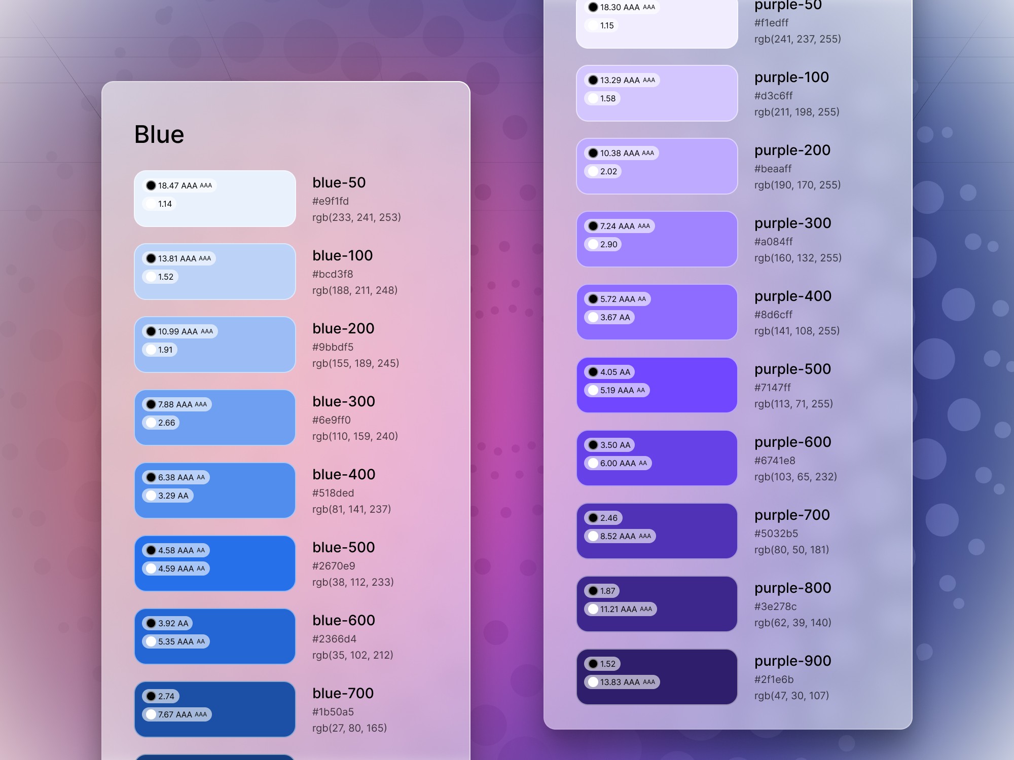
Primitives: Hidden from publishing and scoping, these include basic colors like black, white, red, etc. with different variations. This allows for context on color usage and offers complementary colors.
Semantic colors: Named intuitively to guide users on usage, e.g., "background border," "container divider." Context is important.
Variables scoping: Restricts usage of values to their intended context, making it clear that a border color shouldn't be used for text.
By focusing on consistency, clear naming, and contextual scoping, you're creating a robust design system that's both user-friendly and in sync with industry standards.

Meng To, designer and coder
